IPhone Optimization Made Easy
The is no doubt that with the introduction of IPhone and IPod Touch, mobile browsing has increased dramatically: surveys confirm that iPhone users are hard-core internet junkies. At the same time about 40% of iPhone users say the iPhone has trouble
displaying some websites they want to visit.
So what is the best way of making your EPiServer website iPhone-friendly?
Well, there are several approaches:
- Use one of the external solutions available, some of them are listed on the epimore site.
- Create separate IPhone-specific templates
I will introduce a third option:
Building IPhone-friendly websites using HTML, conditional CSS and jquery.
In this example, I’m using the new demo website for EPiServer CMS 6, “Alloy Technologies”. If you haven’t seen it yet, have a look at http://demo.episerver.com/.
Preparing the IPhone-specific stylesheet
By default, stylesheets apply to all media types. CSS3 recognizes several media types, including print, handheld, and screen. iPhone OS ignores print and handheld media queries because these types do not supply high-end web content. Therefore, use the screen media type query for iPhone OS.
To specify a style sheet that is just for iPhone OS without affecting other devices, use the only keyword in combination with the screen keyword in your HTML file. Older browsers ignore the only keyword and won’t read your iPhone OS style sheet. Use device-width, max-device-width, and min-device-width to describe the screen size.
For example, to specify a style sheet for iPhone and iPod touch, use an expression similar to the following:
<link media="only screen and (max-width: 480px)"
 rel="stylesheet" type="text/css"
href="~/Templates/Demo/Styles/Default/iphone.css" />
To specify a style sheet for devices other than iPhone OS, use an expression similar to the following:
<link media="screen and (min-width: 481px)"
rel="stylesheet" type="text/css"
href="~/Templates/Demo/Styles/Default/Styles.css" />
Controlling the Page Scaling
Unless you tell it otherwise, Safari on the iPhone is going to assume that your page is 980px wide. We want to format our content specifically for the smaller dimensions of the iPhone, so we must let Mobile Safari know about it by adding a viewport meta tag to the Header.ascx file:
<meta name="viewport"
  content="user-scalable=no, width=device-width" />
If you don’t set the viewport width, the page will be zoomed way out when it first loads. The viewport meta tag will be ignored by browsers other than Mobile Safari, so you can include it without worrying about the desktop version of your site.
Adding IPhone CSS rules and behavior using jQuery
When adding css rules to the iPhone.css stylesheet, I used the concepts described in this article:
http://building-iphone-apps.labs.oreilly.com/ch02.html
In short I did the following:
- Removed flash area on front page by using display:none
- Added a main image to display on the front page (hidden by default in styles.css)
- Main menu and sub menu are hidden by default, but accessible by a custom menu button in the top of the page.
- In addition, I decided to hide the quicksearch field, and instead add the Search page to the main menu.
In order to get hold of the search page url from javascript I added a http handler, SearchPageUrlHandler.ashx (see function AddSearchPageToMainMenu in javascript below). The code inside the handler is as simple as this:
public void ProcessRequest(HttpContext context)
 {
   PageData searchPage = null;
   string searchUrl = "";

   PageData startPage =
     EPiServer.DataFactory.Instance.
               GetPage(PageReference.StartPage);
   if (startPage != null)
   {
     PageReference searchPageRef =
           startPage["SearchPage"] as PageReference;
     if (
       !PageReference.IsNullOrEmpty(searchPageRef))
          searchPage =
         EPiServer.DataFactory.Instance.
                   GetPage(searchPageRef);
   }

   if(searchPage != null)
      searchUrl =
           string.Format("<a href=\"{0}\">{1}</a>",
           searchPage.LinkURL, searchPage.PageName);

   context.Response.ContentType = "text/plain";
   context.Response.Write(searchUrl);
 }
Here is my iphone.js file (please read oreilly-link above to learn about the details):
if (window.innerWidth && window.innerWidth <= 480) {
    $(document).ready(function() {
        AddSearchPageToMainMenu();
        $('#MainMenu ul').addClass('hide');
        $('#MainMenu').append(
  '<div class="leftButton"
    onclick="toggleMenu()">Menu</div>');
        $('#Functions ul').addClass('hide');
        $('.SubMenuArea ul').addClass('hide');
    });
    function toggleMenu() {
        $('#MainMenu ul').toggleClass('hide');
        $('#Functions ul').toggleClass('hide');
        $('.SubMenuArea ul').toggleClass('hide');
    }
    function AddSearchPageToMainMenu() {

      var searchLink;

      $.ajax({
          type: "GET",
          url:
   '/SearchPageUrlHandler/SearchPageUrlHandler.ashx',
          data: "{}",
          async: false,
          contentType: "text/plain; charset=utf-8",
          dataType: "html",
          success: function(result) {
              searchLink = result;
         }
        });

        if (searchLink) {
            $('#MainMenu ul').append('<li>' +
               searchLink + '</li>');
        }
    }
}
The result
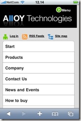
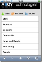
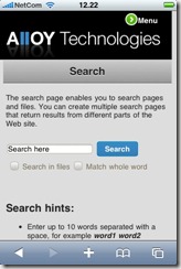
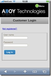
Here are some screenshots taken from my iPhone:
Want to try it (or have a closer look)?
Download the .epimodule file below and install using the “Install a Module from a compressed File” option inside the EPiServer Deployment Center.
Prerequisites for module installation
- EPiServer CMS 6 Release (v 6.0.530.0)
- Public templates installed
- Demo templates installed
Resources
http://building-iphone-apps.labs.oreilly.com/
Safari web content guide
http://www.testiphone.com/



Excellent post and great timing with more requests for mobile support coming in. Thanks Mari!
Cool, looks very nice
Looks great, thanks alot
What happens when Apple approves Opera and Firefox as an alternative browser to IPhone?
I would think you have to check the Request.Browser.IsMobileDevice to see if the client is in fact a mobile, and then check for: Request.Browser.MobileDeviceManufacturer.
I dont know if IPhone actually sends this kind of information, but i sure hope they do :)
This approach uses the browser width to decide which stylesheet to load, so I don't think Firefox and Opera will be a problem. I've used Firefox and Chrome when developing.
If someone want to create a specific design for IPhone users, they can't use this method; because any device that has a width of 480px will get this style?
Dont want to be a troublemaker over semantics, but the devil is in the details :p
The method presented is not IPhone specific, but any devices with a width of 480px, if im not mistaken :)
Very good article and love that you have included pictures for illustrations :) :) :)
This is really Nice blog
/ Abhishek
This is great! Thanks for this!
Hi,
I am using Windows 7 OS.....and i am new to mobile app.....i am trying to test the mobile app functionality,but i didnt hav iphone.....any other alternative? pls suggest........
HI Mari,
Where is your iphone.css file?
Hi,
I already have a site developed in episerver cms 6.If i went to source file of one of the pages and change the tag and tag as described above......then can i view that page in mobile?
Hi,
While i am import date the below error occured......
Exception: Specified part does not exist in the package.[]
Can anyone figure it out?