OnlineCenter Development
|
Product version: |
EPiServer CMS 6.0 / R2 |
|---|---|
|
Document version: |
1.0 |
|
Document last saved: |
Important Note Regarding MVC Version
The information in this technote applies to both EPiServer CMS 6.0 and EPiServer CMS 6 R2 but with one important difference:
- EPiServer CMS 6.0 requires MVC 1.0
- EPiServer CMS 6 R2 requires MVC 2.0
Content
Gadget Development
Developing gadgets for the EPiServer dashboard mostly adheres to the ASP.NET MVC style of development, the main difference being that the workspace is shared with other gadgets. This means certain ways of developing are preferred over others.
The gadget API is a thin layer around standard concepts in ASP.NET MVC. Features on top of this include virtual folder guidance, support for registering routes with mapping to this structure, registration of the controller into the dashboard, support for AJAX server interaction and a client model.
Configuring your project for gadget development
Gadgets are not enabled by default. Instead the project in which they reside must be registered in web.config. This means that the assembly where they reside is associated with a base path on disk and investigated for certain attributes, a route is created and a few other things.
To make this easier you can download a ZIP installer module that enables gadget development in the public templates project. You can read more about this in the Shell Modules section.
Gadget Controller Options
To define and extend the behavior of gadgets there are some attributes and interfaces that can be used on the controller class.
[Gadget]
To make an ASP.NET MVC controller into a gadget you need decorate it with an attribute (and register its assembly as a shell module). This attribute lives in the EPiServer.Shell.Gadgets namespace.
Example:
[Gadget]
public class ElementsController : Controller
{
    public ActionResult Index()
    {
        return View();
    }
}
The [Gadget] attribute has a few options for those looking for localization or changing title and default actions.
[ScriptResource(“Path/To/Script.js”)]
Optionally, you can associate scripts to a gadget. This means that the referenced script is added to the dashboard header. This is usually combined with a gadget client script init method. The path is relative to the shell module in which the gadget exists but can also be app relative (~/) or site relative (/). This attribute lives in the EPiServer.Shell.Web namespace.
Example:
[Gadget(ClientScriptInitMethod = "playground.events.init")]
[ScriptResource("Content/Events.js")]
public class EventsController : Controller
The attribute also supports some additional properties to control the sort index of this particular script and whether the script is located in another module. Multiple attributes are allowed.
[CssResource(“Path/To/Style.css”)]
You can associate a style to a gadget. This means the CSS reference is added to the dashboard’s header. The path is relative to the shell module in which the gadget exists but can also be app relative (~/) or site relative (/). This attribute lives in the EPiServer.Shell.Web namespace.
Example:
[Gadget]
[CssResource("Content/Elements.css")]
public class ElementsController : Controller
The attribute also supports some additional properties to control the sort index of this particular style and whether the style is located in another module. Multiple attributes are allowed.
IGadgetNotify
When creating gadgets you are free to use whatever storage you like. This means that you also might need to clean up your data when a gadget is deleted.
Example:
[Gadget]
public class CleanupController : Controller, IGadgetNotify
{
    // actions
    public void OnDeleted(Guid gadgetId)
    {
        // clean here
    }
}
[Authorize(Roles = “CmsEditors, CmsAdmins”)]
To restrict who may add and use a certain type of gadget you should use the [Authorize] attribute and specify which roles are authorized. This attribute lives in the System.Web.Mvc namespace.
Example:
[Gadget]
[Authorize(Roles = "NoOne")]
public class SecuredGadgetController : Controller
[VerifyGadgetOwner]
In addition to verifying that a user may use a certain type of gadget, it’s also important to check that the gadget actually belongs to the user’s dashboard. This is what the [VerifyGadgetOwner] does.
Example:
[Gadget]
[VerifyGadgetOwner]
public class SecuredGadgetController : Controller
Gadget View Html Helpers
The episerver shell framework contains a number of html helper extension methods that are useful to creating the built-in gadgets available on the dashboard.
Html.GetGadgetId()
Gets the current gadget’s id and returns it as a string.
Example:
<%= Html.GetGadgetId() %>
Html.BeginGadgetForm(…);
When saving data on the dashboard it’s better to use AJAX than posting and re-creating the whole dashboard. Setting up AJAX isn’t very hard, but it’s even easier with the BeginGadgetForm html helper.
Example (this extension has gained some overloads after 6RC):
<% Html.BeginGadgetForm("accept"); %>
    <input type="text" name="text" />
    <input type="submit" />
<% Html.EndForm(); %>
Html.AcceptButton(…)
This simply renders a localized submit input button.
Example:
<% Html.BeginGadgetForm("accept"); %>
    <div class="epi-buttonContainer-simple">
        <input type="text" name="text" />
        <%= Html.AcceptButton() %>
    </div>
<% Html.EndForm(); %>
Html.CancelButton(…)
The cancel button renders an input button that calls the specified action to restore the view.
Example:
<div class="epi-buttonContainer-simple">
    <%= Html.CancelButton(null, new { action="someview"})%>
</div>
Html.ViewInputButton(…)
Creates an input button that, when clicked, loads the specified view in the gadget content area using AJAX.
Example (this extension has gained some overloads since 6RC):
<%= Html.ViewInputButton("View input button", "title", "someview",
    string.Empty, null, new { test = 2, test2 = Guid.NewGuid() })%>
Appearance:

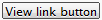
Html.ViewLink(…)
Creates an anchor that, when clicked, loads the specified view in the gadget content area using AJAX. This is useful in master-details scenarios.
Example (this extension has gained some overloads since 6RC):
<%= Html.ViewLink("View link", "title", "someview",
    string.Empty, null, new { test = 3, test2 = Guid.NewGuid() })%>
Appearance:

Html. ViewLinkButton(…)
Creates an anchor with the appearance of a button that, when clicked, loads the specified view in the gadget content area using AJAX.
Example (this extension has gained some overloads since 6RC):
<%= Html.ViewLinkButton("View link button", "title", "someview",
    string.Empty, null, new { test = 4, test2 = Guid.NewGuid() })%>
Appearance:
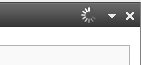
Html.SetGadgetFeedback(…)
You can add text to the gadget title bar area with an extension method. The extension overload allows options for ajax loader, fadeout and disappear after.
Example:
<%= Html.SetGadgetFeedback("feedback message"); %>
Appearance:

Html.AutoUpdate()
To refresh a view periodically you can use this extension method.
Example:
<%= Html.AutoUpdate(TimeSpan.FromSeconds(5)) %>
Labeled inputs for gadgets
Since inputs used in gadgets can have multiple instances present at the same time one cannot use static values for ids. One of the important usages for ids on inputs are to connect them with a label using the “for” attribute. To assist with generating this there is a collection of html helpers:
- LabeledCheckBox
- LabeledDropDownList
- LabeledPassword
- LabeledRadioButton
- LabeledTextArea
- LabeledTextBox
Example:
<%= Html.LabeledTextBox("inputName", "Label 1", "input value", new { @class = "epi-size15" }, null) %>
Will generate an output like this:
<label for="id545">Label 1</label>
<input name="inputName" class="epi-size15" id="id545" type="text" value="input value" />
Gadget Client API
Client Script Init Methods
The recommended approach for gadget interaction in the browser client is a [ScriptResource] attribute in combination with a ClientScriptInitMethod in the [Gadget] attribute. The gadget controller references a script to be added to the dashboard and a method in this script to call for each gadget on a tab. The init method is used to manipulate the gadget’s HTML and/or subscribe to client events.
Example (server):
[Gadget(ClientScriptInitMethod = "playground.init")]
[ScriptResource("Content/Events.js")]
public class EventsController : Controller
Example continued (client):
(function($) {
    playground = {
        init: function(e, gadget) {
            // do stuff and attach to events here
        }
    };
})(epiJQuery);
The Gadget Instance
A class we call gadget instance is passed to the init method. From this class you can access the gadget HTML DOM element, load views, show feedback messages and subscribe to events.
gadget.id
The identifier for this gadget (a GUID).
gadget.element
HTML DOM element accessor for the gadget in question.
gadget.getActionPath(routeParams)
Gets the server URL for a certain action.
Example:
(function($) {
    playground = {
        init: function(e, gadget) {
            var actionPath = gadget.getActionPath({
                action: "ImportantPersons",
                maxCount: 2
            });
        }
    };
})(epiJQuery);
gadget.loadView (routeParams)
Loads a new view into the gadget based on routeParams. Passing null or empty routeParams means that the current action is re-loaded from the server. A benefit of using the gadget’s methods for doing ajax is that the gadgetId is appended to the request and an ajax loader is displayed while waiting for a result.
Example:
gadget.loadView({action: "Configuration"});
Result:
gadget.ajax(epiAjaxOptions)
Sends an AJAX request using jQuery AJAX functionality. Sets an error message in the gadget heading area if something goes wrong during the request.
o epiAjaxOptions extends jquery ajax options object with message property that is used to display ajax loader messages.
Example (custom ajax loader):
gadget.ajax({
     type: "POST",
     url: gadget.getActionPath({ action: "Save" }),
     data: data,
     feedbackMessage: "Saving…" // adds message to ajax loader
});
Example (overriding default success handler):
gadget.ajax({
     type: "POST",
     url: gadget.getActionPath({ action: "Save" }),
     data: data,
     feedbackMessage: "Saving",
     success: function(data){
          gadget.setFeedbackMessage("Success");
     }
});
gadget.isVisible()
Get the gadget’s current visibility (true/false).
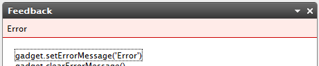
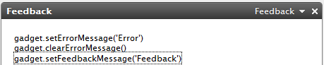
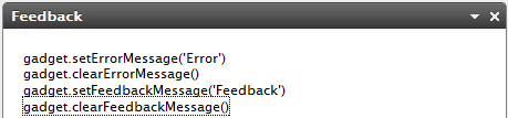
gadget.setErrorMessage(message, options)
Sets an error message in the gadget heading area.
- message – string: Message to display
- options – Object
- details - Detailed text displayed when showing detailed error messages
- status - A status value (http status)
- errorThrown – Whether this error was the result of an unhandled exception
Output:
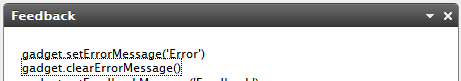
gadget.clearErrorMessage()
Clear the current error message from the gadget heading area.
Output:
gadget.setFeedbackMessage(message, options)
Display a feedback message in the gadget title bar.
- message – string: Message to display
- options – Object
- ajaxLoader – Boolean whether to display the ajax loader image
- feedbackTitle – A text string that will be shown as tooltip to the loading image
- feedbackHideDelay – Number of milliseconds before the message is removed, 0 means shown indefinitely
- feedbackFadeOut – Boolean whether to fade rather than just hide the message after the delay
Output:
gadget.clearFeedbackMessage(options)
Clears the feedback message and removes the ajax loader if visible
- options – Object (optional)
- feedbackFadeOut – Boolean whether to fade rather than just hide the message after the delay.
Output:
Event: epigadgetloaded(e, gadget)
This event is raised:
- after gadget initialization;
- after gadget form submits;
- when gadget has been restored after previous deletion;
- when gadget has been restored after previous tab deletion;
Example:
$(gadget.element).bind("epigadgetloaded", function(e, gadget){
});
Event: epigadgetvisibilitychanged (e, gadget)
This event is called when gadget visibility changes.
Example:
$(gadget.element).bind("epigadgetvisibilitychanged", function(e, gadget){
 var isVisible = gadget.isVisible();
});
Example (how to listen to visibility changed)
ExampleGadgetController.cs:
[Gadget(ClientScriptInitMethod = "epi.exampleGadget.init")]
[ScriptResource("ClientResources/ExampleGadget/ExampleGadget.js")]
public class ExampleGadgetController : Controller
{
 …
}
ExampleGadgetController.js:
(function($, epi) {
    epi.exampleGadget = function() {
        // object returned by function.
        // Exposes public methods and variables.
        var pub = {};
        pub.init = function(e, gadget) {
            $(this).bind("epigadgetvisibilitychanged",
                            gadgetVisibilityChanged);
        };
        var gadgetVisibilityChanged = function(e, gadget)
        {
            alert(gadget.isVisible());
        };
        return pub;
    } ();
} (epiJQuery, epi));
Event: epigadgetmove(e, gadget)
This event is raised after successful gadget movement.
Example:
$(gadget.element).bind("epigadgetmove", function(e, gadget){
});
Event: epigadgetsubmit(e, gadget)
This event is called just before a gadget form gets submitted.
Example:
$(gadget.element).bind("epigadgetsubmit", function(e, gadget){
});
Event: epigadgetunload(e, gadget)
Raised when a gadget is about to be unloaded:
- after tab settings has been changed;
- after tab has been deleted;
- when gadget is going to be deleted;
Example:
$(gadget.element).bind("epigadgetunload", function(e, gadget){
});
Event: epigadgetremove(e, gadget)
This event is raised when the gadget is deleted, either from the delete gadget button or the gadget context menu.
Example:
$(gadget.element).bind("epigadgetremove", function(e, gadget){
});
Gadget Styling
The CSS styles used on the Dashboard resets many of the default styling of elements added by the browser and in some cases adds its own default style. However, this styling may not be enough and some additional classes come to the rescue.
- epi-contentArea and epi-formArea, set on any containing <div> elements.
Registering styles on the dashboard
The best way to get your style sheets on the dashboard is by defining them for your gadgets with the [CssResource] attribute.
Example:
[Gadget]
[EPiServer.Shell.Web.CssResource("Content/QuickChat.css")]
public class QuickChatController : Controller
epi-contentArea
This CSS class gives you a “Dashboard default” look on tables, lists, headings and link colors.
Example:
<div>
    <h2>Two handy CSS classes</h2>
    <ul>
        <li>epi-contentArea</li>
        <li>epi-contentForm</li>
    </ul>
     <table>
        <caption>Table caption</caption>
        <thead>
            <tr>
                <th scope="col">Heading One</th>
                <th scope="col">Heading Two</th>
                <th scope="col">Heading Three</th>
            </tr>
        </thead>
        <tbody>
            <tr>
                <td>Data A</td>
                <td>Lorem ipsum</td>
                <td>Dolor sit amet</td>
            </tr>
            <tr>
                <td>Data B</td>
                <td>Lorem Ipsum</td>
                <td>Dolor sit amet</td>
            </tr>
        </tbody>
    </table>
</div>
The above code would look like this without the use of epi-contentArea class:
Result (no epi-contentArea):
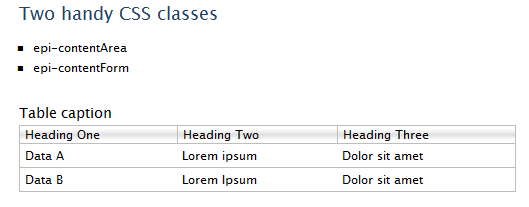
Adding the epi-contentArea class to the containing <div> will change the appearance.
Example:
<div class="epi-contentArea">
    ...
Result (with epi-contentArea):
In most cases epi-contentArea will work fine, but in some scenarios you might want one table to look like the above without affecting any other child elements. In this case, you could use epi-default or epi-simple (no borders or margins) classes directly to the <table> tag.
Example:<table class="epi-default">
epi-formArea
Form elements like fieldset, legend, input, textarea, etc will have very minimalistic styling by default.
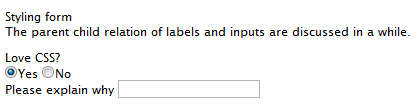
<form action="#" onsubmit="return false;">
    <fieldset>
        <legend>Styling forms</legend>
        <p>
            The parent child relation of labels and inputs
            is discussed below.
        </p>
        <fieldset>
            <legend>Love CSS?</legend>
            <input id="radio1" type="radio" name="radio1"
                checked="checked" value="1" />
            <label for="radio1">Yes</label>
            <input id="radio2" type="radio" name="radio2" value="2" />
            <label for="radio2">No</label>
        </fieldset>
        <div>
            <label for="text1">Please explain why</label>
            <input id="text2" type="text" value="" />
        </div>
    </fieldset>
</form>
Result (no epi-formArea):
Setting the epi-formArea class on the <form> element gives it a more stylized look.
Example:
<form class="epi-formArea">
Result (with epi-formArea):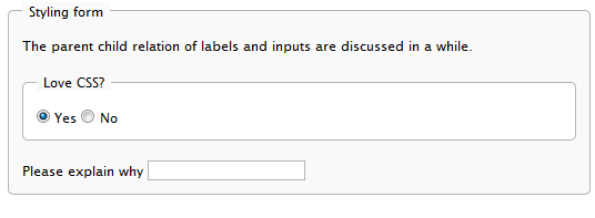
There are also some sizing classes that could be used individually on inputs, selects, labels or containers for labels.
- epi-size3 (Not on labels or containers for labels)
- epi-size10
- epi-size15
- epi-size20
- epi-size25
- epi-size30 (Not on labels or containers for labels)
Note: Does not work on the <select> element in IE at the moment. They will still take the width of the content.
By setting an input element inside a label, the label will automatically be associated with the input without having to set the “id” attribute on the input (and the “for” attribute on the label). This is perfectly valid HTML and we easily avoid having the same id twice in a page, which the use of two gadgets of the same kind in a page would result in.
The parent child relation also results in some nifty alignment possibilities of labels and form fields:
<form action="#" onsubmit="return false;" class="epi-formArea">
    <fieldset>
        <legend>Styling form</legend>
        <div class="epi-size10">
            <label for="label1">Label one</label>
            <input id="label1" class="epi-size3" type="text" />
        </div>
        <div class="epi-size10">
            <label for="label2">Label two</label>
            <input id="label2" type="text" class="epi-size15" />
        </div>
        <div class="epi-size10">
            <label for="label3">A really long label which will break row</label>
            <select id="label3" class="epi-size15">
                <option>Option One</option>
                <option>Option Two</option>
            </select>
        </div>
        <div class="epi-size10">
            <label for="label4">Label four</label>
            <input id="label4" type="text" class="epi-size30" />
        </div>
    </fieldset>
</form>
Dashboard Management
Some aspects about users’ dashboard can be configured.
Default dashboard layout
The default dashboard layout is an empty tab but this can be changed via configuration.
The forRoles attribute in the templates/add element contains a list of role names separated by comma. When the new user first time enters the dashboard, his dashboard is created according to the template for his role. If the user has several roles and for these roles different templates defined, we use the first matched template.
The layout attribute in the tabs/add element defines the layout for a tab. The dashboard currently supports “1 Column”, “2 Column” or “3 Column”.
Example:
<episerver.shell>
  <dashboard>
    <templates>
      <add forRoles="Administrators, OtherRole">
        <tabs>
          <add name="Default" layout="3 Column">
            <gadgets>
              <add column="0" name="EPiServer.Cms.Shell.UI.Controllers.QuickLinksController" />
            </gadgets>
          </add>
        </tabs>
      </add>
    </templates>
  </dashboard>
</episerver.shell>
Disabling gadgets
Gadgets can be disabled via configuration. The name key to use can be specified in the [Gadget] attribute but is the same as the controller type name by default. Disabling the gadgets in this way doesn’t remove them from user’s dashboards. They are just filtered from the add gadgets list.
Example:
<episerver.shell>
  <dashboard>
    <disabledGadgets>
      <add name="EPiServer.Cms.Shell.UI.Controllers.QuickLinksController" />
    </disabledGadgets>
  </dashboard>
</episerver.shell>
Shell Modules
Views and client resources in OnlineCenter need a virtual path where they can be found. For this reason they are organized into modules. EPiServer CMS is shipped with two modules. The first, a module called Shell, contains the dashboard and resources shared between multiple products. The second – CMS – contains resources specific to the CMS.
Modules are further organized into protected and public. Public and protected modules are essentially the same except for the root path below which they are expected to be found. The root path for protected modules is configured by a location block to only allow authenticated editors.
Configuration (web.config)
Modules are configured in web.config. This allows EPIServer to associate a virtual path to an assembly containing gadgets and other plug-ins.
Example:
<episerver.shell>
  <publicModules rootPath="~/modules/" autoDiscovery="Minimal">
    <add name="QuickChat">
      <assemblies>
        <add assembly="QuickChat" />
      </assemblies>
    </add>
  </publicModules>
</episerver.shell>
The example above defines a module of the assembly QuickChat.dll and associates it with the virtual path /public/QuickChat.
Example (relocated resource path):
<episerver.shell>
  <publicModules rootPath="~/modules/" autoDiscovery="Minimal">
    <add name="PublicTemplates" resourcePath="~/">
      <assemblies>
        <add assembly="EPiServer.Templates.Public" />
      </assemblies>
    </add>
  </publicModules>
</episerver.shell>
The example above configures a module called “PublicTemplates”. The module’s location on disk is the root of the application (~/). This means that relative references to client resources and menu items will be based on this URL. Furthermore, the module is mapped to an assembly, EPiServer.Templates.Public. This means that controllers in this assembly are routed through the path format “/modules/PublicTemplates/{controller}/{action}”. This route is set up by the shell initialization module.
protectedModules & publicModules
These elements contain collections of shell modules. protectedModules are mapped to a path protected by ASP.NET authorized rules. publicModules’ path is open to everyone.
Attributes:
- rootPath – Required. The root path where modules will be located and routed.
- autoDiscovery – Option for probing the module folder and loading of module assemblies automatically on start-up. The default is “Minimal”. Changing this to “Modules” will result in folders below the root path to be added as modules automatically.
Module (add element)
The publicModules and protectedModules elements themselves in web.config contain a collection of registered modules. These modules define assemblies and virtual paths. By default a module is expected to be found in a folder with the same name as the module itself. This folder should be located in the configured rootPath (as configured per public and protected modules).
Attributes:
- name – Required. The name of the module. This is used to find the module directory.
- resourcePath – Optional. The path of the module. This overrides the default location of the module.
- clientResourcePath – Optional. An alternative location for client resources. By default this path is the same as resourcePath.
Elements:
- assemblies - Assemblies to load and associate with the module. This value may be combined with assemblies defined by the module depending on the auto discovery option.
Example (web.config):
<add name="ShellExtras" resourcePath="~/Somewhere/Else/Extras" clientResourcePath="~/Somewhere/Else/Entirely/Extras">
  <assemblies>
    <add assembly=" EPiServer.Shell.Extras" />
  </assemblies>
</add>
Extending the Navigation
OnlineCenter is equipped with extendable navigation. This allows EPiServer CMS and other products to be accessed by editors from the top menu. The preferred way of adding an interface to the menu is using the [MenuItem] attribute. Other options include configuration and implementing a custom menu provider. Both attributes and menu providers needs to reside in an assembly configured as a shell module.
[MenuItem] attribute
Menu item is an attribute used on ASP.NET MVC controllers and WebForm pages. This attribute adds links to the top menu (requires the module to be registered, see Shell Modules). The required parameter menuPath is a logical path of the menu element in the menu. The URL to the actual interface to link to is added using the Url parameter.
Example (WebForm page):
[MenuItem("/global/cms/edit", Text = "Edit", Url = "Path/To/Default.aspx")]
public partial class DefaultPage : SystemPageBase
{
}
This adds a menu item to the CMS menu section with the text Edit and the URL /[PublicOrProtected]/[ModuleName]/Path/To/Default.aspx.
Example (MVC action):
public class DashboardController : Controller
{
    [MenuItem("/global/dashboard", Text = "Start")]
    public ActionResult Index()
    {
    }
}
This adds a menu item to the top menu bar with the text Start and the URL is inferred from the ASP.NET MVC route table.
Localization
Localization of menu items defined with attributes is done via a static property of a resource class. ResourceType references a class with a static property. TextResourceKey is the name of the static property that returns the localized text.
Example:
[MenuItem("/global/dashboard", TextResourceKey = "Start", ResourceType = typeof(MenuResources))]
Menu Path
In order to organize menu items in a tree structure the menu path is used. All menu items in the top menu are in the “/global” bucket. The next segment is the name of menu section, e.g. “/global/cms”. The last segment represents the actual user interface, e.g. “/global/cms/edit”.
Url
Some menu items have an URL. This creates a link in the menu. The page at the end of this URL should render a menu where the corresponding menu path is selected.
Permissions
You can restrict who sees a certain menu item by using the [Authorize] attribute.
Example:
public class DashboardController : Controller
{
    [MenuItem("/global/dashboard")]
    [Authorize(Roles = "NoOne")]
    public ActionResult Index()
    {
    }
}
Menu Providers
The building blocks of the navigation are menu providers and menu items. A menu provider provides an enumeration of menu items which are organized in a tree according to their menu path. EPiServer CMS contains a menu provider that looks at [MenuItem] attributes and provides them as menu items.
IMenuProvider
A slightly more technical alternative to attributes to extend the standard menu is implementing a menu provider. The menu provider is responsible for returning menu items that are correctly localized. For a menu provider to be used it needs to implement the IMenuProvider interface, be decorated with the [MenuProvider] attribute and be part of a registered shell module.
Note for future compatibility: The [MenuProvider] attribute extends a library that will be changed in a version after EPiServer CMS 6. This means that any code using this attribute will need to be recompiled.
Menu Items
It is possible to add menu sections and sub-menu items. The types supported are menu sections, drop-downs, URLs and pop-up menu items. Each menu item defines a path which decides it’s location in the menu hierarchy. E.g. a URL menu item with path /global/cms/myMenu is placed in the CMS section of the menu (which has the path /global/cms).
Types:
- URL Menu Item: these are links, a click navigates to specified URL
- Popup Menu Item: these are links opened in a popup window (javascript window.open)
- Section Menu Item: these are top menu sections which open an underlying menu
- Drop-down Menu Item: these are drop-down style menu items designed for the utility menu area (right)
Example:
/// <summary>
/// Provides menu items for the CMS product.
/// </summary>
[MenuProvider]
public class CmsMenuProvider : IMenuProvider
{
    /// <summary>
    /// Provides the CMS menu section and the CMS settings section.
    /// </summary>
    /// <returns>
    /// A list of <see cref="MenuItem"/>s that the provider exposes.
    /// </returns>
    public IEnumerable<MenuItem> GetMenuItems()
    {
        // Create the top menu section
        var section = new MenuSection("CMS", // Title
                                      "/global/cms"); // Logical path
        // Visible to CMS editors
        section.IsAvailable = (request) => PrincipalInfo.HasEditAccess;

        // Create the edit menu item below the top section
        var cmsEdit = new UrlMenuItem("Edit", // Title
                                      "/global/cms/edit", // Logical path
                                      "/path/to/edit/default.aspx"); // URL
        // Visible to CMS editors
        cmsEdit.IsAvailable = (request) => PrincipalInfo.HasEditAccess;
        return new MenuItem[] { section, cmsEdit };
    }
}
Localization
A menu provider is responsible for returning localized menu items.
Permissions
The menu provider can defer permission filtering to the menu item by setting the “IsAvailable” delegate to a method that checks access for the user provided with the RequestContext parameter.
Example:
var cmsEdit = new UrlMenuItem("Edit", "/global/cms/edit", "/path/to/edit/default.aspx");
// Make menu item visible to CMS editors
cmsEdit.IsAvailable = (request) => PrincipalInfo.HasEditAccess;
Flow of menu items
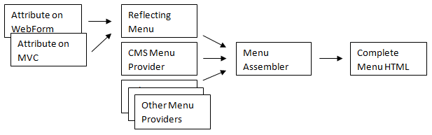
Menu items flow from the providers to into a hierarchical model which is rendered into HTML.
Configuration
A third alternative to extend the menu is configuration (web.config).
Example:
<episerver.shell>
    <navigation>
      <add text="Intranet" menuPath="/global/intra" url="http://intra" sortIndex="100" />
      <add text="My section" menuPath="/global/my" menuItemType="Section" sortIndex="300" />
      <add text="Edit" menuPath="/global/my/edit" url="/my/edit.aspx" sortIndex="100" />
      <add text="Admin" menuPath="/global/my/admin" url="/my/admin.aspx" sortIndex="200" />
    </navigation>
</episerver.shell>
Adding Search Providers
OnlineCenter features search functionality by aggregating results from several search providers. Each provider reports results based on a specific category, e.g. Pages, Blogs, Files etc.
EPiServer CMS includes three search providers:
- MenuSearchProvider: searches among the menu items.
- PagesSearchProvider: searches for CMS pages (including page content)
- FilesSearchProvider: searches for CMS documents
[SearchProvider] attribute
To add a custom search provider, you need to configure your assembly as a shell module (see documentation about shell modules). The next step is to implement the ISearchProvider interface and decorate the class with the [SearchProvider] attribute.
Properties:
- Area is used to prioritize search providers in the current “area”. This means that search providers for the CMS area will be placed first when performing a search from the edit and admin interfaces.
- Category is used as display name in the user interface.
Methods:
- Search returns an enumeration of hits for the given query.
Note for future compatibility: The [SearchProvider] attribute extends a library that will be changed in a version after EPiServer CMS 6. This means that any code using this attribute will need to be recompiled.
Example:
[SearchProvider]
public class FilesSearchProvider : ISearchProvider
{
    /// <summary>
    /// Area that the provider mapps to, used for spotlight searching
    /// </summary>
    public string Area
    {
        get { return "CMS"; }
    }

    /// <summary>
    /// The category that the provider returns hits in
    /// </summary>
    public string Category
    {
        get { return "Files"; }
    }

    public IEnumerable<SearchResult> Search(Query query)
    {
        return ...
    }
}
OnlineCenter look and feel
To mimic the OnlineCenter look and feel on a page you need the menu along with some styles and scripts from EPiServer Shell.
ASP.NET WebForms
To hook a web form page into the menu and use the OnlineCenter look and feel you need to decorate the code-behind class with the MenuItem attribute and use some web controls in the ASPX template.
Example (WebForm.cs):
[EPiServer.Shell.Navigation.MenuSection("/global/webform")]
[EPiServer.Shell.Navigation.MenuItem("/global/webform/relative", Text = "relative", Url = "WebForm.aspx")]
public partial class WebForm : System.Web.UI.Page
{
}
Continued example (WebForm.aspx):
<%@ Page Language="C#" AutoEventWireup="true" CodeBehind="WebForm.aspx.cs" nherits="EPiServer.Shell.WebForm" %>
<%@ Register TagPrefix="sc" Assembly="EPiServer.Shell" Namespace="EPiServer.Shell.Web.UI.WebControls" %>
<%@ Import Namespace="EPiServer.Shell.Web.Mvc.Html" %> <!DOCTYPE html PUBLIC "-//W3C//DTD XHTML 1.0 Transitional//EN"
"http://www.w3.org/TR/xhtml1/DTD/xhtml1-transitional.dtd">
<html xmlns="http://www.w3.org/1999/xhtml" >
<head runat="server">
<title>WebForm</title>
<!-- Shell -->
<%=Page.ClientResources("Shell")%>
<!-- LightTheme -->
<%=Page.ClientResources("ShellLightTheme")%>
<!-- Navigation -->
<%=Page.ClientResources("Navigation")%>
</head>
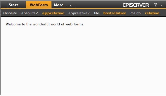
<body>
<form id="form1" runat="server">
<div>
<sc:ShellMenu ID="ShellMenu1" runat="server" Area="CMS" />
<div class="epi-padding">
Welcome to the wonderful world of web forms.
</div>
</div>
</form>
</body>
</html>
Result:
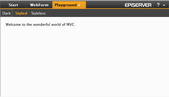
ASP.NET MVC
For users of the ASP.NET MVC the steps to hook into the menu and use the OnlineCenter look and feel are similar to WebForms:
Example (NavigationController.cs):
[MenuSection("/global/playground", Text = "Playground")]
public class NavigationController : Controller
{
    [MenuItem("/global/playground/index", Text = "Styled")]
    public ActionResult Index()
    {
        return View();
    }
}
Continued example (Views/Navigation/Index.aspx):
<%@ Page Language="C#" Inherits="System.Web.Mvc.ViewPage" %>
<%@ Import Namespace="EPiServer.Shell.Web.Mvc.Html" %>
<%@ Import Namespace="EPiServer.Shell.Navigation" %> <!DOCTYPE html PUBLIC "-//W3C//DTD XHTML 1.0 Transitional//EN"
    "http://www.w3.org/TR/xhtml1/DTD/xhtml1-transitional.dtd">
<html xmlns="http://www.w3.org/1999/xhtml" >
    <head runat="server">
        <title>Index</title>
        <!-- Shell -->
        <%=Page.ClientResources("Shell")%>

         <!-- LightTheme -->
        <%=Page.ClientResources("ShellLightTheme")%>

        <!-- Navigation -->
        <%=Page.ClientResources("Navigation")%>

        <!-- Shell init script -->
        <%= Html.ShellInitializationScript() %>
    </head>
    <body>
        <div id="epi-globalDocument">
            <%= Html.GlobalMenu() %>
            <div class="epi-padding">
                Welcome to the wonderful world of MVC.
            </div>
        </div>
    </body>
</html>
Result: