Use connectorBlock to choose how a block is rendered.
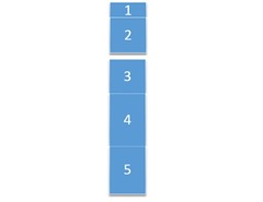
Blocks are nice to reuse content, EPiServer developers already know all the benefits of using blocks. A while back a customer asked me if it was possible to “remove the white space around a set of blocks in a content area so the whole set looks like one block, but other blocks, let’s say the first and second block should look as one block and then block 3, 4 and 5 should look as one block”. like so : Now I first thought let’s make a boolean property on the base type “IsConnected”, this worked fine but when the same block was used somewhere else the block was always connected. This was unacceptable according to the customer.
Then I thought of an empty blocktype called Connectorblock, it does not render anything but when in the content area it “stitches” the blocks together, allowing for different stitching on different pages.
I wrote a helper to retrieve the correct css Class
Code:
public static class GroupingClassHelper
{
public static string GetGroupingCssClass(this HtmlHelper helper, IList<ContentAreaItem> items, int index)
{
const string firstCss = "group first";
const string attachedCss = "group attached";
const string lastCss = "group last";
bool NextItemIsConnector = false;
bool PrevItemIsConnector = false;
if (index < items.Count - 1) // don't go out of bounds
{
NextItemIsConnector = ((items[index + 1].GetContent() as ConnectorBlock) != null);
}
// if this is the first block then this one gets class first or (null if the next block is not a connector)
if (index == 0) return NextItemIsConnector ? firstCss : null;
var prevContent = items[index - 1].GetContent() as ConnectorBlock;
PrevItemIsConnector = (prevContent != null);
// if previous block is a connector is then this block gets attached class or last class if the next one is not a connector
// else (previous block is not a connector and this block is not the first block (index > 0)) then this block gets class first (null when next one is not a connector)
return PrevItemIsConnector ? (NextItemIsConnector ? attachedCss : lastCss) : (NextItemIsConnector ? firstCss : null);
}
}
Now all you need to do is add connector blocks between the blocks that need to be stitched together and alter your CSS to render the margins accordingly.
I hope somebody has any use for this idea.

Nice, I've had similar ideas.
I think it's easier for the editor to understand if there is less space by default and a block like this adds space instead.
But if you had spacing by default and want to reduce, this is a more seamless implementation.
Alf,
You are right, separate blocks is the default, only a few block need to be stitched together.