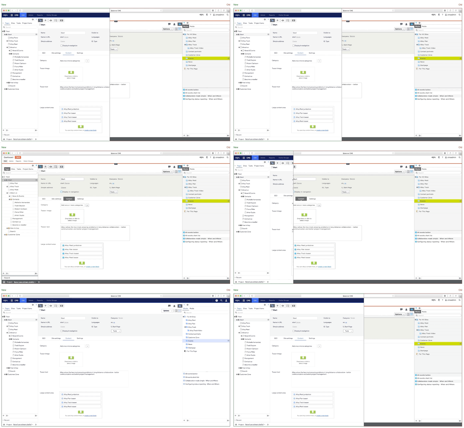
CMS UI refresh
Probably one of the first things that you will notice in refreshed CMS UI is the navigation menu. During our research time, we compared a few different navigation patterns across Episerver products and other common patterns. We decided on a harmonized version that uses patterns that should work for all. When we finalized navigation rules and wireframe sketches it was time to zoom into details and focus on style and colors.
Our color palette is based on Episerver's brand story, and we are using formulas to come up with different shades for our colors. Collaboration with our marketing designers brought a lot of inspiration and we were able to find a creative way to blend our brand colors into the UI elements. There are two opposites to balance between colors that should grab your attention (marketing) and colors that you'll stare at a whole day (product). After colors, we were focused on finding a new typography font, with the goal to use it through the whole UI.
At this point, we had enough to build the new menu. After replacing the old CMS UI menu with the new one we had something that looked promising, but the rest of the CMS UI needed a bit of "flattening". Removing all gradients from UI elements, and replacing them with solid colors made an immediate difference. We also decided that we should not use borders as separators in the content trees, tables, and some menus. Border radii were also tweaked. Last but not least, we decided to redesign some of the icons in order to make UI more modern.
We hope that you like what you see.


Nice, looking forward to working with it.
Also great to see a use of the word radii.
Thank you Jake! :)
Found some stuff that needs to be addressed for better usabillity
1.You cant ctrl + click "Edit" or "Admin" and open in new tabs
2. Nor can you navigate with tab to open these menus
Hope to get these options back
Edit: Nav with Arrows seem to work
Well done Alexsandar. I have heard good things about how much more clean if feels.
Anyone know where the "to view mode" globe link went? It used to be to the left of the help icon. We used that all the time! Now there is no way to view the site outside of the CMS without editing the url. Or am I just missing it?
Thank you for feedback Gosso! I will forward it to the team.
This post is more about the new look of CMS but we do appreciate usability feedback! :)
Thank you so much Joshua! This means a lot to my team and me! :)
Hey Jason, you can still do it trough "options -> view on website"
The new ui is very nice. I would like to add the new styling for buttons and such to our own addons, but when I use the classes shown at http://ux.episerver.com is does nothing to them. How can I use this new style in our own views too?