3 small, but helpful UI changes in CMS 12.10
1. Accessible Help Text
What
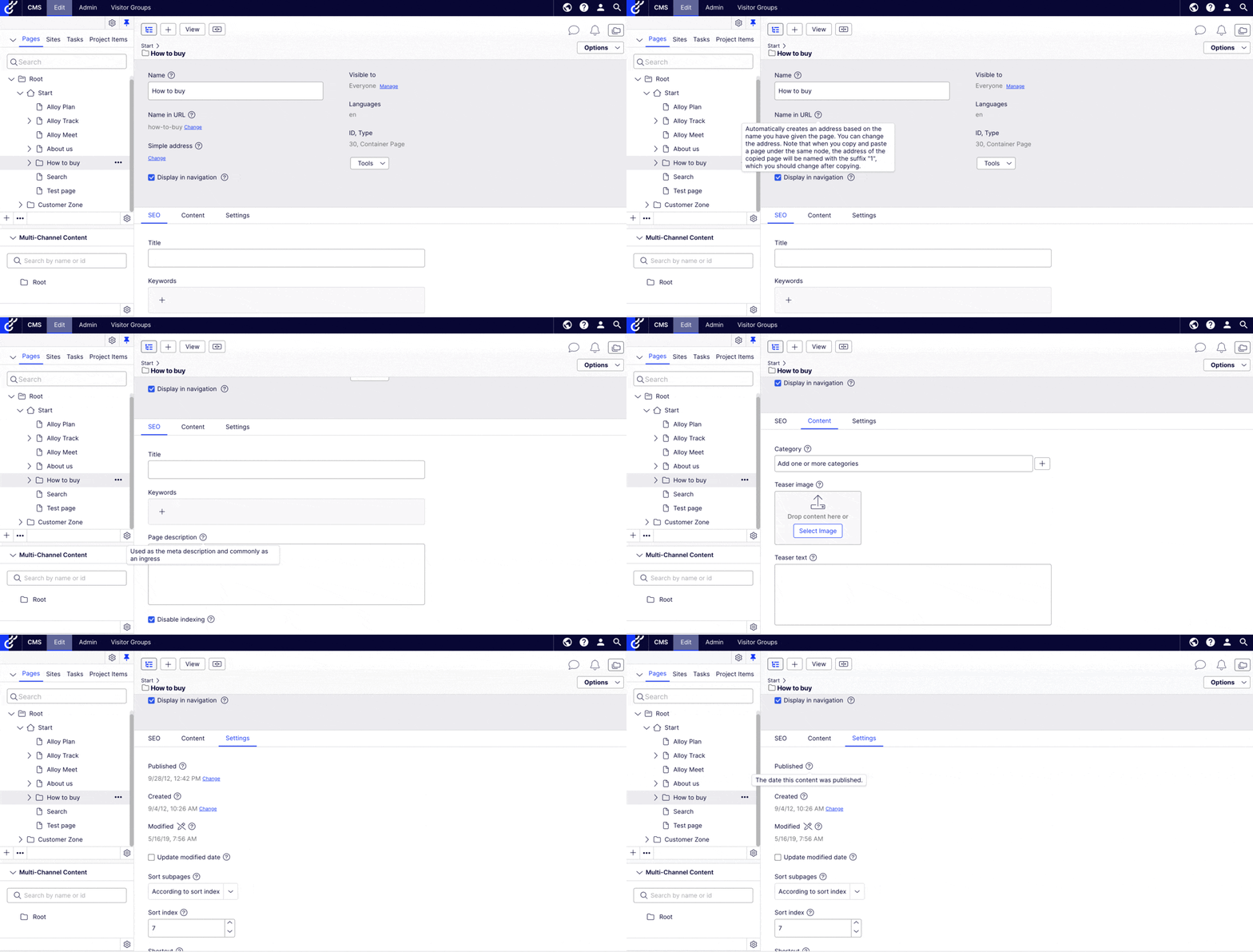
A clickable help icon displays next to a property that has associated help text. You also can hover over the help icon. The help text can contain hyperlinks. You can dismiss the help text by clicking X or clicking outside of it.
This replaces a very hidden, often inaccessible help text format that was used in previous versions of the CMS.

Why
Even though customisable help texts have been available in the CMS for a while, most editors didn’t know they existed. They had to hover over the text for 2 seconds to make it appear, with no clear indication whether a help text existed in a given scenario.
If you wish to watch me use the previous version of this, click here.
This action also required mouse dexterity or letting go of the mouse, since you can’t move the cursor if you want the text to continue displaying.
Even when the help text appeared, it was not displayed in an accessible manner. The previous tooltip was not hoverable, which caused frustrations to users as most editors tend to move their mouse over the tooltip on reflex when they were read. This is sometimes forced too due to screen magnification. The displaying help text on some components also conflicted with the alt text of images inside it.
Note: this change replaces a popular workaround many of our customers used in previous years: https://talk.alfnilsson.se/2014/12/18/display-help-text-in-on-page-editing/
We are aware of use cases where a permanently displayed, configurable text under the labels would make more sense than a clickable help text. Stay tuned, we are working on giving you the option to do that too.
2. Labels Displayed Above Components
What
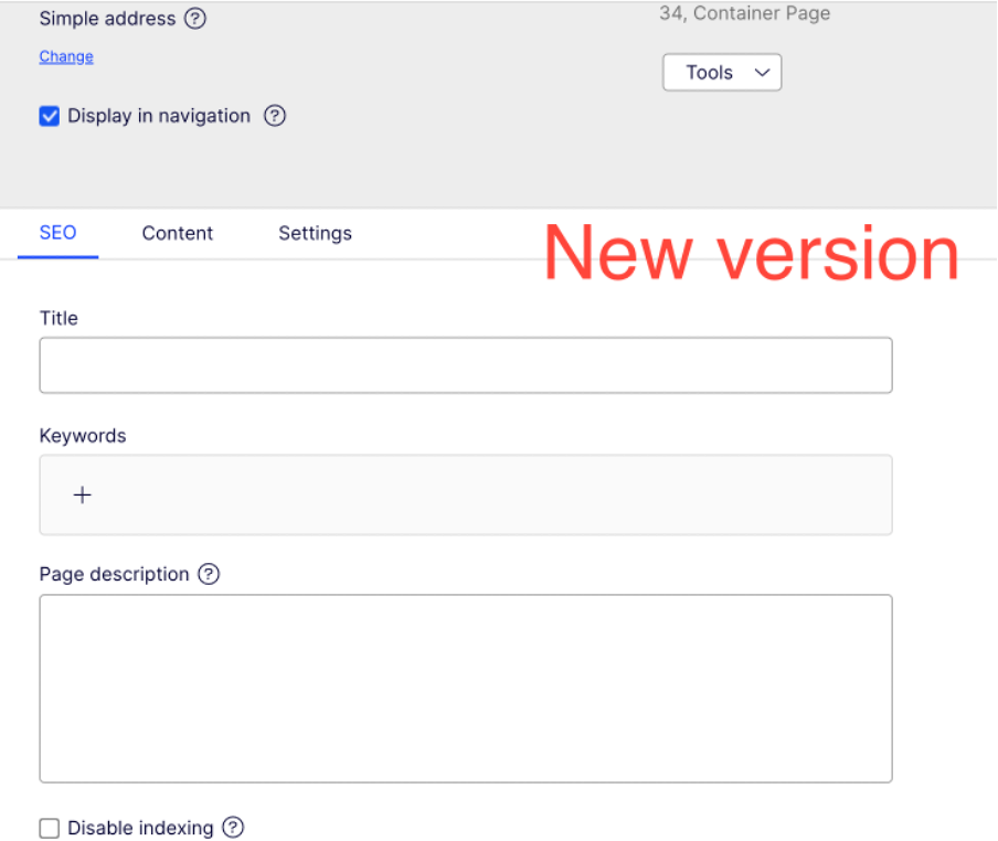
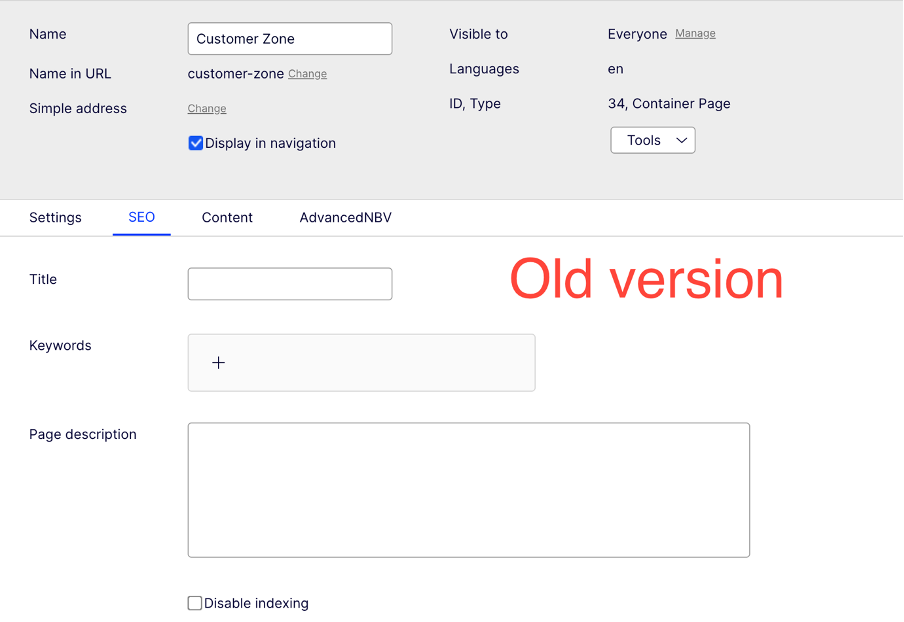
Labels in Edit mode are displayed above input fields, improving screen utilisation across all screen sizes.
Why
Customers using multiple Optimizely products find discrepancies between different product user interfaces to be frustrating. We are making adjustments to reduce this friction in a way that improves the general usability of our product. Moving labels above the input fields also makes space for the upcoming, permanently displayed "help/warning text" referenced above.
3. Increased and Aligned Property Width
What
The images in #2 demonstrate this clearly, we increased and aligned the width of input fields.
Why
Content creators prefer having a larger text area in which they can work, and found the size of some of our input fields to be impractical in the past.
We are making further improvements in that area - keep an eye out for the upcoming tinyMCE6 upgrade that might be coming with a full screen text editor!


I like the fine-tuning, but I'm not sure I can live without descriptions that are always visible. Sometimes we have to direct users to other fields due to content tree inheritence.
Hi Kenny,
We should have the ability to add always visible descriptions or restriction texts under the labels shortly! We will also make sure that these are configurable from the admin UI too (not just from the codebase). I'll share an update once it's been released! :)