Improving And Unifying The UI
We aim to unify and make a seamless user experience across all Optimizely products. This change will make our products more predictable, easy to use, and accessible. Therefor the CMS in Content Cloud has, over the last few versions (starting with 12.3.0), received multiple updates to the UI. This work is still ongoing, and in the coming weeks/months we expect to release even more updates. However, we wanted to pause and talk a bit about what we have done recently.
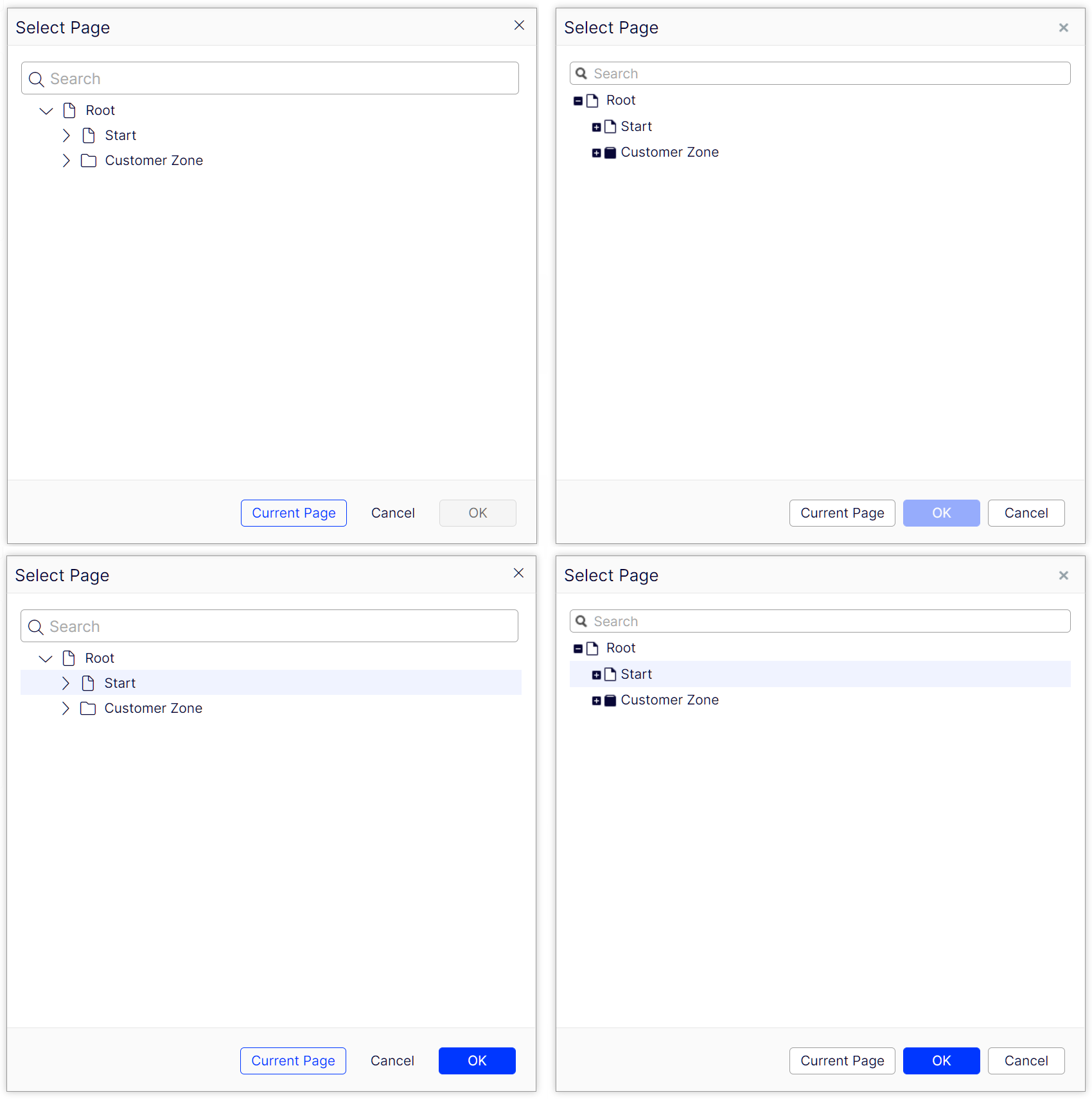
Let’s start with a direct comparison of how the UI has changed during this period. The screenshots below clearly outline the differences.

Image: A comparison of form edit between 12.7.0 (left) and 12.2.0 (right).
The UI now uses icons from Font Awesome Pro 6, which is a font-based icon library which in turn means that there are fewer resources to download and the icons scale better since they are vector-based. Icons are no longer solid instead, they are outlined, more sharp, crisp, and modern looking. All products from Optimizely use the same set of icons.
The new icons use the same CSS classes as the old ones did, so for example the home icon still uses the .epi-iconObjectStart CSS class. However, the new icons use a licensed version of Font Awesome 6 Pro, and this limits how the icons can be used. Third-party add-ons and extensions need to use either a free version of Font Awesome 6/equivalent or purchase their license. The new icons have the following sizes, small (16 x 20), medium (24 x 30), and large (32 x 40).
Spacing has also been reworked to introduce more padding to create an improved visual clarity, balancing the layout and making it easier to overview. By introducing more white space into the layout important elements draw the user’s attention, allowing the user to focus on call-to-action items and making everything easier to read. In general, alignment has been given an overhaul as well.
Primary buttons have moved to the right-most side in a button group and the secondary button no longer has a border unless it receives focus or the user hovers on it. This further makes the primary button easier for the eye to catch.

Image: Button placement and disabled state in 12.7.0 (left) and 12.2.0 (right)
Disabled buttons are not transparent anymore. Instead, they have a specific look to them to make sure that they stand out as inactive. For example, a disabled primary button was previously a muted blue that became brighter when enabled. Now the disabled version is instead grey and becomes blue once enabled.
Content Selectors have been reworked to support the user in selecting content without using drag and drop. This was made possible by allowing all content selectors to have a drop-down menu that allows the user to select as well as create content. Drag-n-drop is still present in the UI and the borders of drop zones have been adjusted so that they are coherent and visible.

Image: Creating and selecting content in 12.7.0 (left) and 12.2.0 (right).
Multi-targeting .NET 6 and .NET 5
As of EPiServer.CMS.UI 12.4.0 our nugets multi-target both .NET 6.0 and .NET 5.0. EPiServer.CMS.TinyMCE 3.2.0 also supports both as well as EPiServer.Telemetry.UI 2.1.0.
This was a small selection of the many updates that have been made in the UI and as you upgrade you will discover many more. In the coming versions the team will work on more updates, and we are looking forward to your feedback.
New support for tiff files
The CMS UI supports tiff files and adds Tiff to SupportedEditExtensions list. Currently, tiff is quite an old image extension and It is supported by a few browsers (for example, safari, IE11).
What is in the box?
- On Chrome/other browsers users can:
- Upload a .tiff image
- Open in Image Editor to edit a .tiff image
- On Safari/IE11 browser users can:
- Upload a .tiff image
- DnD a .tiff image into Image property (content reference/content reference list/link item collection/URL to (doc,image, page), XhtmlString, Content Area)
- Open a .tiff image on OPE or All properties mode
- Open in Image Editor to edit a .tiff image
- View a .tiff image on View mode
Known issues
- Thumbnails in Media gadget have a hard-coded content-type (image/png) in CMS Core, and they are not going to change it. That explains why tiff or ico files don't show thumbnails.
- We only support *.tiff extension. *.tif is not supported

Great work Robert