CMS UI refresh
This was originally released as CMS UI 11.21.0. Due to unintended semantic breaking changes, we have removed CMS UI 11.21.0 from nuget and will re-release in the future with some additional bug fixes. We suggest downgrading to CMS UI 11.20.x for now. Thank you for your feedback and patience. :)
We are introducing a refreshed editor interface in a future release, here is a preview. The new navigation menu is functionally different from its predecessor, but the changes outside of the navigation are purely cosmetic. In order to prevent breaking changes, the new navigation will not automatically replace the old global menu in custom implementations, such as in add-ons; code changes will be required if an add-on wants to use the new navigation instead.
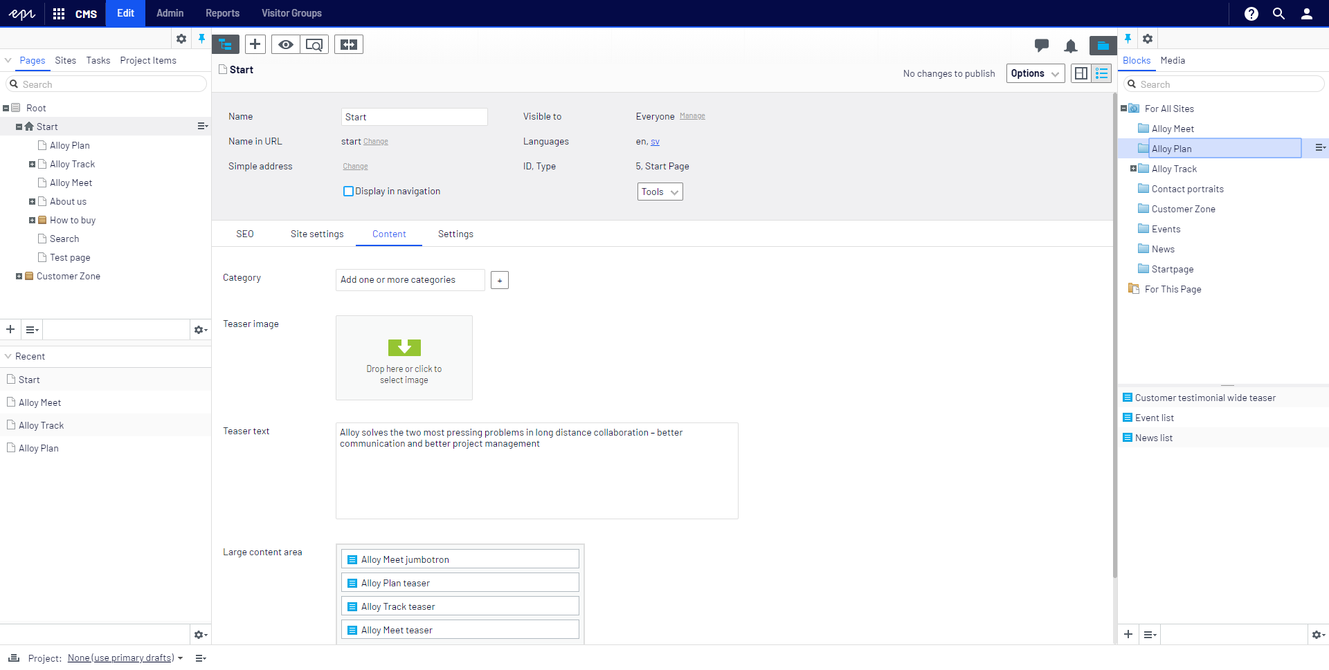
Our first change was to completely redesign CMS UI navigation. This modern navigation takes up less screen space by moving product navigation into a waffle menu in the top left that opens a drawer.
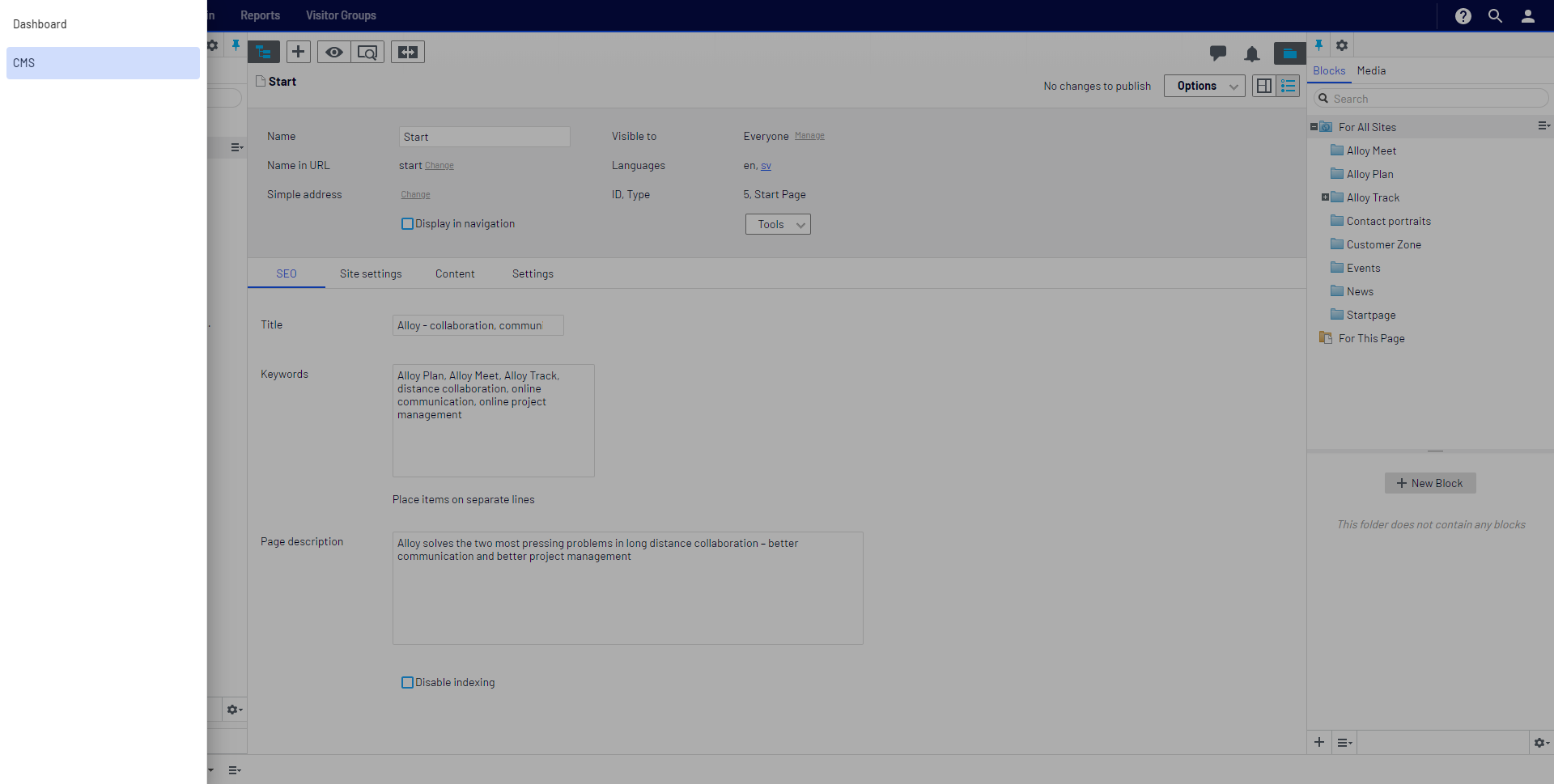
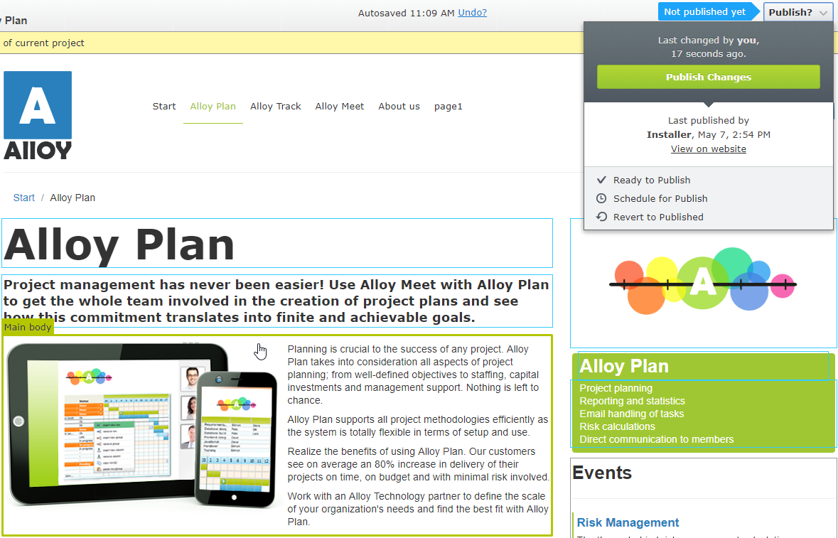
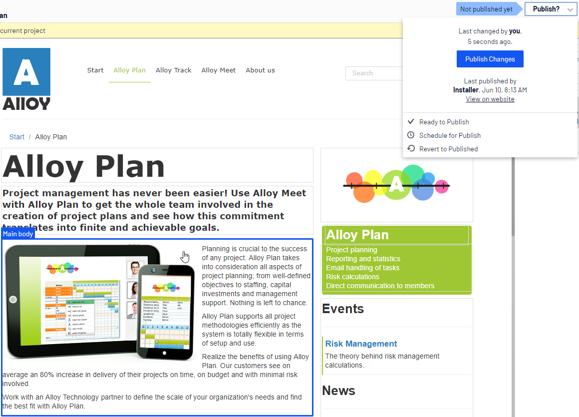
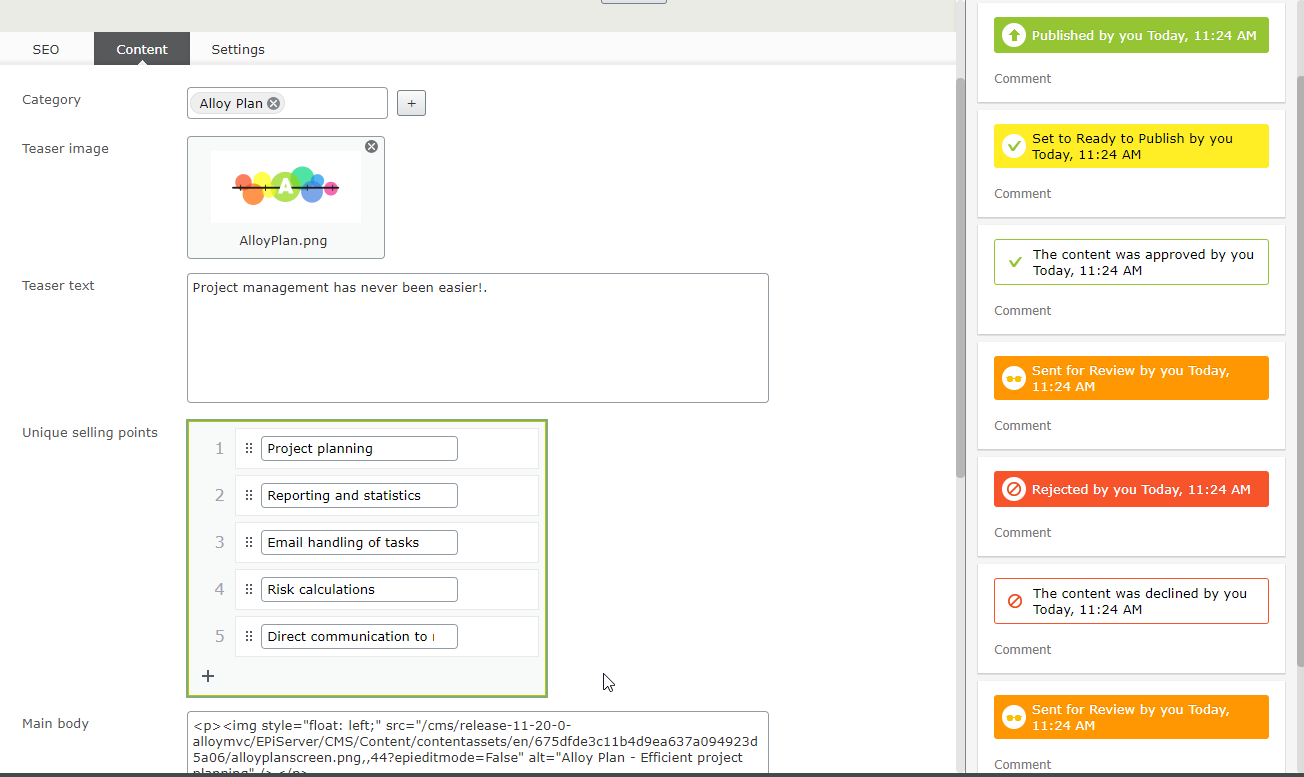
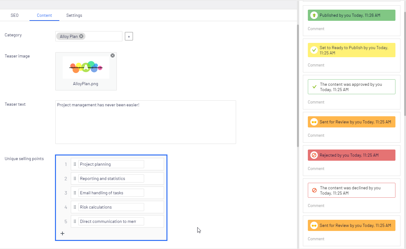
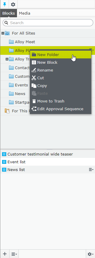
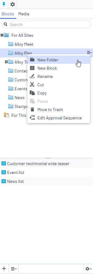
Once the new navigation was in place, there was a very noticeable stylistic difference between the navigation and the old UI. We set out to bring the UI more in sync with the navigation. To accomplish this, we modified the colors, flattened buttons, removed some dividers for a cleaner look and feel, and changed the font.
Before and after comparisions:

Very nice! Releasing this to customer today and so far so good! :)
Looks good!
But... Before you do release make sure you also update documentation like https://world.episerver.com/documentation/developer-guides/CMS/user-interface/Extending-the-navigation/ since this does not work anymore with the new interface. The @Html.Raw(ClientResources.RenderResources("Navigation")) is resulting in <script type="text/javascript" src="/admui/CMS/11.21.0/ClientResources/ReportCenter/ReportCenter.js"></script>
And none of the RenderResources is rendering the required styles for the new look!!!
From hamburger menus to waffles! Love it!

Another feedback is to add <a>-tags in the menu so that you follow wcag or a least you can ctrl-click to open admin in another tab i chrome.
I've just tried it out and really like the new look but, just to reinforce Eric's comment above, the new layout causes issues with other add-ons such as Find. Aside from the fact that the UI around Find is still in orange rather than blue, you can no longer access the Find sub-nav and, trying to click back from Find to the CMS is pretty tricky as the sub-nav for the CMS is also inaccessible in the Find UI.
It'd also be good if the quicknavigator was updated from orange to blue for consistency.
+1 on links should be links. Hate when you cannot open a link in a new tab.
And yes, navigation is a mess now when navigating to an add-on. How do we use the new navigation in our on views?
There is too little contrast in on-page-edit now. You can hardly see the overlay since it's white now.
+1 on Johans comments.
I will try this out and report back
We agree with Johan's comment.
Are we going to see an update for the Find UI relatively quickly? Its a really weird workflow, as none of the top level buttons (except for dashboard) work.
very nice !
It seems like using
instead of
will render the new global menu.
Like Eric said, an official update of the docs would be nice.
Thanks for all of the feedback!
<a> tags for right click/ctrl click support is currently in progress.
We're looking into Find/add-on issues.
We'll also be reviewing the documentation to update outdated sections.
I would say you implemented breaking changes into this release since we need to change all modules for rendering the new menu. I looks nice but breaking all modules except CMS sounds like a breaking change and needs. A sugestion might be to actuelly test with modules as well since no one is using CMS only. If you run it on DXC you have at least FIND included..
I hope you'd make this backwards compatible, so that calling Html.GlobalMenu() would render the correct menu depending on UI version. Or else we have to make all our modules depende on 11.21 instead of 11.1
The idea is for the new navigation menu to be opt-in as the add-on/Product might want to restyle their UI and do some navigation differently. Using the "old" navigation should continue working as before so if it isn't then it's a bug and not a breaking change, and will be fixed.
Lovely!
Anyone know where the "to view mode" globe link went? It used to be to the left of the help icon. We used that all the time! Now there is no way to view the site outside of the CMS without editing the url. Or am I just missing it?
So even with latest version of Find(13.2.4 ), Find still loads the "old" style sub navigation? This is quite confusing for the editors.