
Improve user experience with restriction information
In EPiServer.CMS.UI 12.28.0, an improvement for restriction information is added.
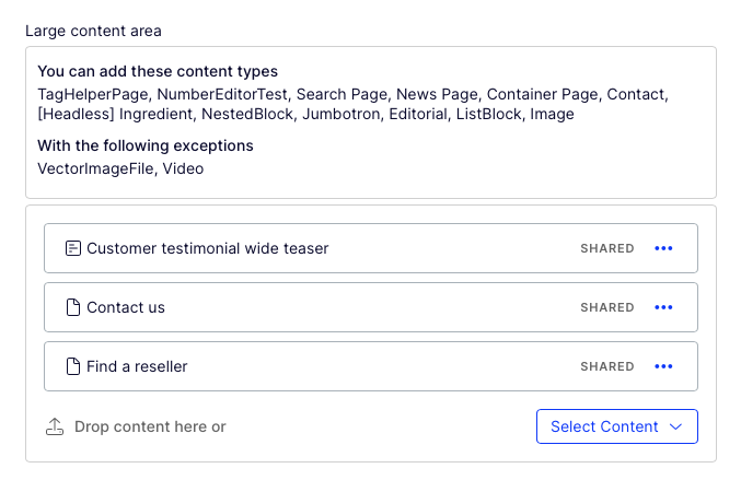
Previously the restriction information takes quite a lot of space, especially for big sites with a long list of restricted types.
This new improvement reduces the space significantly while still gives editors information about restricted types they need to know.
Before:
Now:
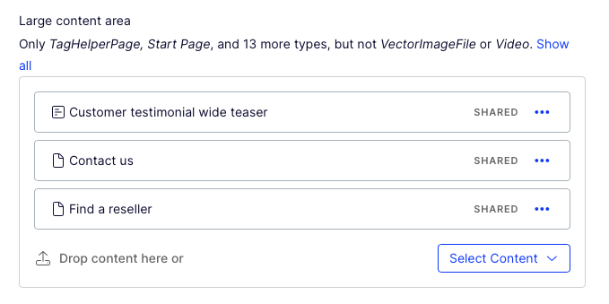
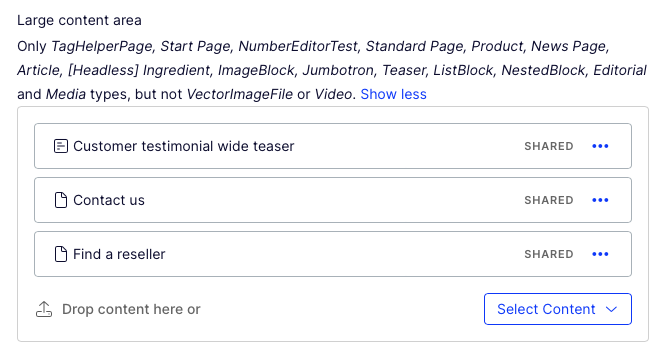
Users can expand the list to view all restricted types, and collapse it if they want.
Mar 19, 2024
Thanks.
Can you improve the users experience by doing this one too?
https://feedback.optimizely.com/ideas/CMS-I-410
Mike Malloy The suggestion sounds reasonable. But it will need to go through our product manager to evaluate the design and prioritise the work. Thank you for bring it up!
Hello Linh,
This is a very nice quality of life change. I've seen and implemented the usage of interfaces to classify block types to make block restrictions easier to manage across the solution. Examples being blocks that have interfaces of IFullWidthBlock, ITwoThirdsBlock, IHeroBlock etc. It allowed you to apply restrictions very easily and to include a new block to the LeftContent areas across all templates very quickly:
The previous iteration of the restrictions hint text wasn't terribly helpful as it said "You can add these content types: block". I can see this updated version works a lot nicer, however you wouldn't want the "undefined" part of this.

Please note in this quick example I only have one block using the interface.
Thank you :)
Thank you, Mark Stott! We do have a bug for it (CMS-32870), hopefully we can fix it soon.
Thank you Linh :)
Here is the bug link, it is recently set public https://world.optimizely.com/support/Bug-list/bug/CMS-32870
Hi!
Looks good! But I noticed that the Swedish translations for the contentreferencelisteditor restriction texts are missing.
We run the UI in Swedish and that text comes up in English.
Is that something that you would like me to report as a bug?
Hi Linda Mohacsi,
We are aware that some texts aren't translated. We often have a bit delay with translation. But I will make sure to have the translated texts release soon.
Thanks Linh! Then we will be patient :)
It's kind of a "fun fact" that swedish translations are missing these days, since the swedish traditionally was the first language you did translate, as of my memory, being around and knowing the history from ElektroPost AB => EPiServer => Optimizely... With the solid base in Stockholm... I guess swedish translations should be the bare minimum included after every review and before every release... ;)
Jonas, we will try to improve.