New EPiServer 7 intermediate build: The good, the bad and the ugly
Yesterday EPiServer released an intermediate build of EPiServer 7 to a few selected developers. Although the build itself is not public, I have gotten permission from EPiServer to blog about it ![]()
The new edit UI
What’s new
There are quite a few changes/additions between this build (7.0.524.0) and the EPiServer 7 Preview build (7.0.449.1).
Here are the changes according to EPiServer:
-A brand new preview function.
-A page settings header that groups the most important properties of pages and blocks. (currently visible in forms editing mode).
-Managing deleted pages and blocks.
-Support scheduled publishing.
-Support for linking data (external URL, internal link, fetch data etc.) from the new UI.
-Support for viewing form data from the new UI.
-Simplified creation of blocks.
-Support for categorization of blocks.
-Support for managing access on global blocks.
-Support for inline editing of some additional property types (e.g. page type, sort order rule etc.).
-Improved enterprise support.
-A lot of additional UX improvements
The good
Better block editor
The best change in this version is definitely the improvement to how editors work with blocks. The changes might be minor, but the effect on editor friendliness is not.
First of all you are not completely thrown out of the page you where working when creating a new block, thanks to a “Back” link that takes you back to the page you are working on.
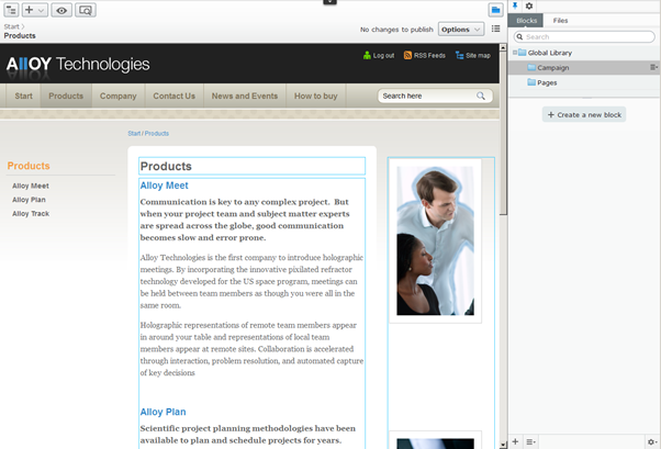
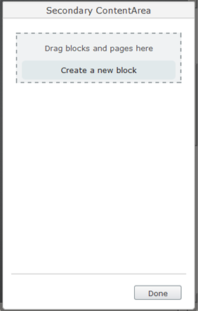
You can also create and add a block directly to a content area (or so I think, it doesn’t work in this build, but that is probably a bug)
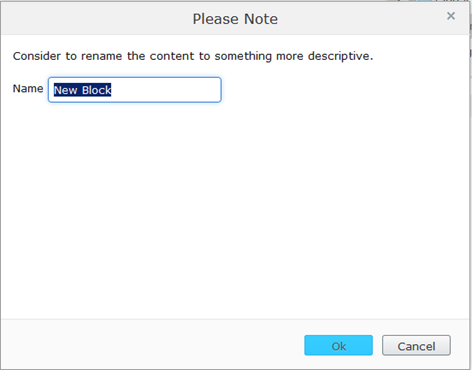
Another annoyance in the preview is that your block would be called “New block” unless you remembered to name it before choosing block type. In this build you get a warning:
Also you get more space to work with your “shared blocks”, see the next point.
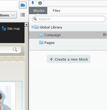
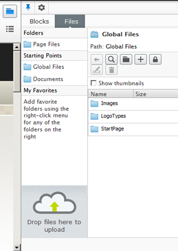
The right side gadgets pane aka “assets pane” is shown as default and gadgets are tabbed
The gadgets pane has always felt very crowded in EPiServer 7. Moving the gadgets to separate tabs makes much more sense and enough room to work with blocks, files, versions etc.
The blocks gadget is selected
The files gadget is selected
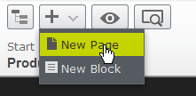
The new page/block button is more accessible
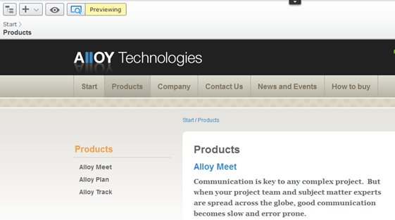
The preview button is more accessible and works better
The preview button now keeps you inside edit mode, but hides all the green boxes so you can see what the page really looks like. Also you can click links inside properties and navigate your way to another page you want to edit as the preview is “sticky”. Once you are on the page you want to edit simply click the preview button again. Perfect!
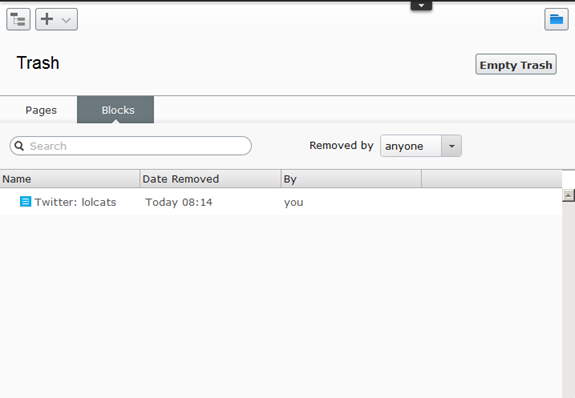
We now got a trash can
This build includes a trash can for both pages and blocks. It is no longer located under the root page and is accessed through a hidden button. Ok, it is not really hidden, but that button is damn hard to find ![]()
The bad
The block work flow could be even better
In this build it is very easy to go to a page, create a new block and click the back link without first publishing the block. The block will be created and you can add it to your page, but it won’t show up in the published page as the block itself is not yet published. This has been handled with greying the block out, but I think there should be an even better solution to this problem.
Lots and lots of blocks
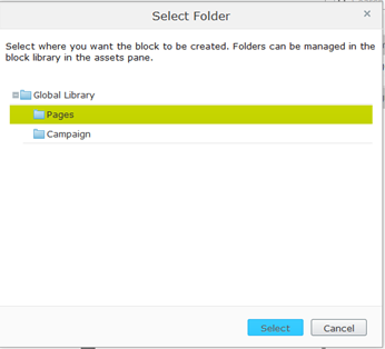
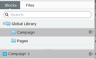
On a production site you will end up with hundreds or even thousands of shared blocks. EPiServer has address this through a folder dialog that pops up when you create a new block as well as search.
What I would like to see is the addition of “block type name” to the block listings. This will make it much easier for the editor to select the right block on the first try.
E.g.
Campaign 1 - Teaser
Campaign Images - Image Gallery
Campaign 1 - Twitter
Also:
-The trash button is hard to find
-There are still a few bugs here and there, but that is to be expected.
The ugly
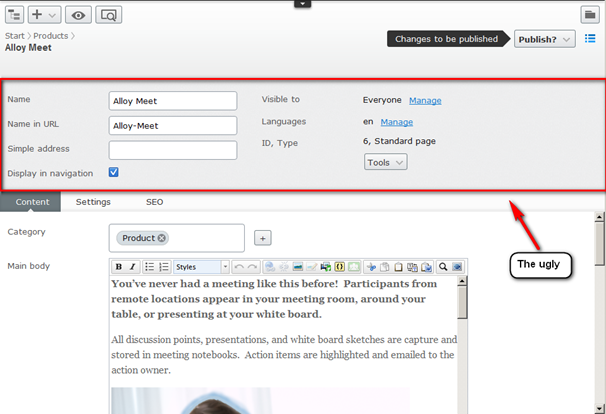
This change is described as
“A page settings header that groups the most important properties of pages and blocks. (currently visible in forms editing mode). “
In this build this header is always open and takes up a lot of space. I expect it to be hidden somehow in the final build.
The page settings header
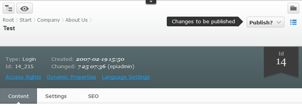
What it looks like in the preview
To sum it up
EPiServer 7 is inching ever closer to release and this build is a big leap in the right direction. Getting blocks to work 100% for editors is a must for a modern CMS like EPiServer 7, so I hope the team will make the final adjustments to this before release.
And guess what: I don’t miss the right click menu! (Good work team, you proved me wrong).

Thanks very much for your Post. As I'm (not so) patiently waiting for the release of 7 to hear about the progress that is being made beyond the Preview towards the actual release is great.
However, the details of your Post only increase my anticipation for the release of 7; which is good right?
Interesting post, Alexander!
What are your plans for implementing EPiImage in EPiServer 7 CMS?
Or is it perhaps already done, just waiting for the actual release?
Best regards
Christian
Hi Christian,
I have created the ImageResizer part for EPiServer 7, but not the EPiImageProperty nor EPiImageGalleryProperty. Not sure if the first one is needed any more. Need to figure out how to do the latter.
Hi Alexander,
Could you please share the recent status about EPiImage for EPiServer 7? I saw 7x folder on epifolder, but seems nothing is done there yet.
javascript:WebForm_DoPostBackWithOptions(new WebForm_PostBackOptions("ctl00$MainRegion$LeftBodyArea$ucComments$CommenButton", "", true, "CommentValidation", "", false, true))
[strange error occurred during submit, so attempt #2]
Hi Alexander,
Could you please share the recent status about EPiImage for EPiServer 7? I saw 7x folder on epicode, but seems nothing is done there yet.