Improve user experience with ContentArea and ContentReference
In EPiServer.CMS.UI 12.1.0, several user experience improvements were made.
Easily navigate to the selected item in ContentReference properties
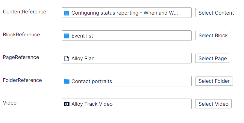
The Edit/View command is added to the selected item, so now users can easily go to that item. If the selected item is a block, it also has the Quick Edit command.

The Edit/View command is available even if the ContentReference property is readonly

Display restriction information for ContentReference and ContentArea
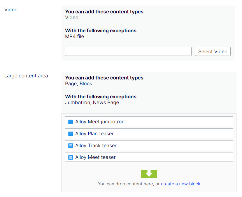
You can see which content types you are allowed or disallowed to add to the current ContentArea or ContentReference, the same way ContentReferenceList has.
The old message is removed when there is no restriction.
"You can add these content types
All"
Change button text from ... to Select [Type]
The button text now explicitly indicates which content type you can select.

Widen the input field for ContentReference properties
ContentReference input field becomes wider. Currently it only applies for main content area. In dialogs, it still keeps the old length.

Looks good, the only thing is some big sites I've worked on have nearly 100 content types, so if the "Exceptions" list is everything it's going to get VERY messy
Hi Scott!
Thanks for your feedback. I think it's a good point and I think we can introduce a setting option to make customers be able to turn the restriction info on or off.
Yes or maybe you can show the first x number and click to expand or show in an overlay or something to see the full list.
Hi Linh!
I was looking for a way to disable the "Display restriction information for ContentArea" feature on Epi-Documentation. Is this feature available yet?
@Trí Lâm We don't have such feature. Can you explain why you want to disable the restriction information in Content Area?
The restriction information takes up too much space, so we want to hide it. It should be shown in the field descriptions.
I sent the feedback to our Product team. We have a draft version of how it should be. Hope that it can be released soon.
Looks good. Thank you, for your support !
Trí Lâm I am implementing the new design, so if everything goes well, it can be released in a month or two.
I understand it can be very annoying for the properties with many restrictions. If you cannot wait for our release, a hack that you can do is to change the css for the restriction info area like below (Note: I haven't tested it, but I think/and hope it will not break anything)
Trí Lâm The feature is now released, please check https://world.optimizely.com/blogs/linh-nguyen/dates/2024/3/improve-user-experience-with-restriction-information/
Thank you, Linh!