A critical vulnerability was discovered in React Server Components (Next.js). Our systems remain protected but we advise to update packages to newest version. Learn More.
ARCHIVED This content is retired and no longer maintained. See the version selector for other versions of this topic.
Customizing the toolbar
The Toolbar is a set of buttons, menus, and text with structure and action commands defined in XML. The following top menu examples show how to modify toolbar items.
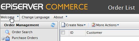
Adding a toolbar item
Add a new item to the Welcome menu on top of the page by creating the TopMenu.xml file in the ~/Apps/(ModuleName)/Config/View folder.
Note: If the XML contains an unsupported element, the NotSupportedException exception is thrown.
Toolbar attributes
id. Unique identifier within XML.
text. Element label (button, menu and so on).
imageUrl. Element icon (only used for Menu, SplitButton, Button).
cssClass. Element stylesheet css class.
align. Element location (can be Left, Right). The default value is Left.
handler. Client handler which is called when element is clicked; the client method name must be specified; the element object is passed as a parameter to the client method.
commandName. Server command; enableHandler of that command determines whether an element is visible.
itemSplitter. Added to a Splitter element, can have the following values:
None (default). Separator is not added.
Left. Separator is added to the left of the element.
Right. Separator is added to the right of the element.
Both. Separator is added on both sides of the element.
tooltip. Define element tooltip.
permissions. Text parameter passed to the enableHandler for the command.