Five New Optimizely Certifications are Here! Validate your expertise and advance your career with our latest certification exams. Click here to find out more
- Add-ons
- Architecture
- BLOB providers
- Caching
- Client resources
- Configuration
- Configuring .NET SignalR
- Configuring episerver
- Configuring episerver.basicAuthentication
- Configuring episerver.dataStore
- Configuring episerver.framework
- Configuring episerver.packaging
- Configuring episerver.search
- Configuring episerver.shell
- Configuring Image Service
- Configuring link validation
- Configuring Live Monitor
- Configuring module.config
- Configuring staticFile
- Reading application settings programmatically
- Content
- Providers
- Properties
- Built-in property types
- Built-in auto-suggestion editor
- Restricting content types in properties
- Single or multiple list options
- Writing custom attributes
- Custom properties
- Property attributes
- Property controls
- Property settings
- Assets and media
- Content assets and folders
- Custom editing preview for media
- Media types and templates
- Working with media
- Synchronization
- Selecting content
- Refactoring content type classes
- Persisting IContent instances
- Block types and templates
- Content
- Content Type attributes
- Converting page types for pages
- Creating a page programmatically
- Creating page templates and block controls
- Edit hints in MVC
- IContentRepository/DataFactory interface
- Links
- Localizing the user interface
- Page types and templates
- Deployment
- About the database
- Deployment Center
- Deployment scenarios
- Development environment
- Mirroring
- Planning deployments
- Setting up multiple sites
- Dynamic content
- Configuring dynamic content
- Creating a Hello World dynamic content
- Creating a plug-in
- Creating UI settings for dynamic content
- Using the interfaces
- Dynamic data store
- Editing
- EPiServer CMO
- Installing and configuring the aggregation service
- Integrating EPiServer CMO with external applications
- Configuring Live Monitor for multiple bindings
- Configuring the statistics handler
- Event management
- Globalization
- Initialization
- Localization
- Logging
- Personalization
- Rendering
- Adding edit hints without using Property web control
- Creating a main menu
- Creating a submenu
- Display channels
- Display options
- Navigation menus and listings
- Selecting template based on tag
- Template descriptor
- Using data source controls
- Reports
- Routing
- Scheduled jobs
- Search
- About EPiServer Full-Text Search Client
- About EPiServer Full-Text Search Service
- Adding search providers
- Configuring EPiServer Full-Text Search Client
- Configuring EPiServer Full-Text Search Service
- Installing and deploying Search Service
- Search integration
- Searching and filtering
- Searching for pages based on page type
- Security
- AspNet Identity OWIN authentication
- Authentication and authorization
- Configuring Active Directory membership provider
- Configuring Web Services authentication
- Federated security
- Forms authentication
- Managing cookies on the website
- Mixed mode OWIN authentication
- OWIN authentication
- Permissions to functions
- Protecting users from session hijacking
- Recommendations for ASP.NET security settings
- Securing edit and admin user interfaces
- Virtual roles
- User interface
- Command Pattern
- Context-sensitive components
- Creating a component
- Describing content in the UI
- Developing gadgets
- Dialogs
- Drag-and-drop
- Extending edit view
- Extending the navigation
- Introduction to Dojo
- Message service pool
- Object editing
- Publish and subscribe messaging system
- Service locator
- Shell profile
- Store architecture
- Technical overview
- Using jQuery
- Views
- Virtual path providers
- Workflows
- XForms
Display channels
Table of contents
Introduction
The idea with display channels is to make it possible to control the rendering of content depending on the request. One example is to control which templates (WebForm, UserControl, View or partial view) that should be used to render depending on the request (for example, which browser it is). Another option is to have a single template but in that template check which channels are active and then control output (for example, which stylesheet to use) depending on active channel. This means it is possible to target the output for example specific devices.
WebForms: DisplayChannel
To create a DisplayChannel to be used with WebForms you create a class that inherits EPiServer.Web.DisplayChannel. There is no need for an explicit registration of the channel, during initialization the system will scan and register all found channel instances. The method IsActive is where you add your logic that controls if you channel is to be considered active for a request. When the system tries to resolve which template (WebForms or UserControl) to use to render an item it will check which DisplayChannels that are active and then it will prefer templates that has a tag included in EPiServer.Framework.DataAnnotations.TemplateDescriptorAttribute.Tags that matches EPiServer.Web.DisplayChannel.ChannelName for the active channel.
The following example shows a simple DisplayChannel that is active for mobile devices:
public class MobileDisplayChannel : DisplayChannel
{
    public override bool IsActive(HttpContextBase context)
    {
        return context.Request.Browser.IsMobileDevice;
    }

    public override string ChannelName
    {
        get { return RenderingTags.Mobile; }
    }
}
If we then have two different templates registered for same type and one template has a tag that matches the ChannelName then that template will be used when the channel is active.
The following example shows two different templates for same type:
[ContentType]
public class MyBlock : BlockData {}

[TemplateDescriptor(Default=true)]
public partial class MyBlockControl : BlockControlBase<MyBlock>
{ }

[TemplateDescriptor(Tags = new string[] { RenderingTags.Mobile })]
public partial class MyBlockMobileControl : BlockControlBase<MyBlock>
{ }
MVC: IDisplayMode
To register a System.Web.WebPages.IDisplayMode to be used with MVC you register your instance with EPiServer.Web.DisplayChannelService. The reason for registering the IDisplayMode towards EPiServer and not directly against ASP.NET is to make it possible for editors to preview the channel even if the request it self does not match the channel condition. That is for example to make it possible for an editor to view the site as it would appear for a mobile device even if the editor is working on a regular browser. Otherwise the same conventions as for System.Web.Mvc applies which is if for example if a channel “mobile” is active then the convention is to prefer a view named like Index.mobile.cshtml before one named Index.cshtml.
The following example shows how to register a simple IDisplayMode that is active for mobile devices:
public void Initialize(EPiServer.Framework.Initialization.InitializationEngine context)
{
    context.Locate.DisplayChannelService()
        .RegisterDisplayMode(new DefaultDisplayMode(RenderingTags.Mobile)
    {
        ContextCondition = (r) => r.Request.Browser.IsMobileDevice
    });
}
DisplayChannelService
If you need to know which channels that are active for a request you could get the active channels from EPiServer.Web.DisplayChannelService. The service can be retrieved either from EPiServer.ServiceLocation.ServiceLocator.Current or from EPiServer.ServiceLocation.ServiceLocationHelper which is exposed in several locations, for example, in PageBase, UserControlBase, InitializationEngine if you have a using statement for namespace EPiServer.Web. This can be useful for example when you want to select stylesheet depending on active channel.
The following example shows how to set a CSS class depending on if mobile channel is active:
public partial class ABlockControl : BlockControlBase<MyBlock>
{
    protected override void OnLoad(EventArgs e)
    {
        base.OnLoad(e);
        CssClass = Locate.DisplayChannelService().GetActiveChannels(new HttpContextWrapper(HttpContext.Current))
            .Any(c => String.Equals(c.ChannelName, RenderingTags.Mobile, StringComparison.OrdinalIgnoreCase)) ?
            "MobileMainArea" : "MainArea";
    }

    protected String CssClass { get; set; }
}
Previewing content
There is a possibility for the editor to preview the site with different channels active. When the editor selects to preview the site for a specific channel all requests to IsActive on the DisplayChannel and IDisplayMode instances are shortcutted and the one that is selected for preview will “fakely” return true for the request.
Adding a new device to view resolution
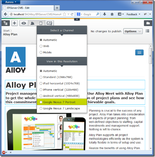
In the user interface there is a feature for changing the size of the preview view port. This is intended to give the editor a quick way of visualizing a page as it would turn out when shown on a smaller screen. A few devices are set up in the Alloy Templates project, and it is very easy to add your own.
One popular device these days is the Google Nexus 7 tablet, this section describes how to add a preview option for it to the preview resolutions drop-down list.

Looking at the hardware specs you can see that the native display resolution on the Nexus 7 is 1280 by 800 pixels, but these values cannot be used straight away. The reason is that most high resolution mobile devices apply scaling and actually report different screen dimensions than the physical ones. The iPhone 4 for instance, reports the same screen dimensions as the iPhone 3 even though its display sports four times as many pixels. Therefore you need to know which resolution the device actually reports to get as close as possible to reality. An easy way of figuring this out is to pay this screen size test page at Quirksmode.org a visit with the device in question and check the reported window width and height. For the Nexus 7 in portrait mode you get a reported canvas size of 600 by 790 pixels, and in landscape mode 960 by 440 pixels. The difference in width/height between the different modes is caused by soft buttons and browser chrome (location bar and tabs).
Now when you have this information, you can add a new option to the resolution section of the view drop-down list by implementing the interface EPiServer.Web.IDisplayResolution
public class Nexus7PortraitResolution : IDisplayResolution
{
    public string Id
    {
        get { return GetType().Name; }
    }

    public string Name
    {
        get { return "Google Nexus 7 Portrait"; }
    }

    public int Height
    {
        get { return 790; }
    }

    public int Width
    {
        get { return 600; }
    }
}
Now build and reload and you should have a new display resolution option available.
Adding a background device image
If you inspect the HTML structure around the preview iframe you will notice an auto-generated CSS class named epi-viewPort-600x790, where the numbers correspond to the dimensions specified in the definition above. Define this CSS class to customize the look of the view port – assuming you are in the Alloy sample project – you add a new CSS file ClientResources/Style/displayresolutions.css with the following contents:
.epi-viewPort-600x790
{
    background: url('../images/nexus7.png') no-repeat center center;
}
The image nexus7.png referenced in the CSS class above is a background image picturing the Nexus 7, and is shown behind the scaled down view port.
To get this CSS file loaded when the user interface loads you will need to go to piggy-back on the CMS module’s resource bundle. Knowing that the CMS module depends on a resource bundle named epi.cms.widgets.base you can add your CSS file to this resource bundle from the module.config of your project.
<clientResources>
    <add name="epi.cms.widgets.base" path="Styles/displayresolutions.css"
         resourceType="Style" isMinified="false" />
</clientResources>
Now your displayresolutions.css file will be loaded whenever the CMS module is started, in other words when going to the editorial interface.
Keep in mind that there is no file watch on module.config, so changes are not picked up automatically by the application. Therefore you will have to touch web.config or restart the application by other means to see the changes on the site.
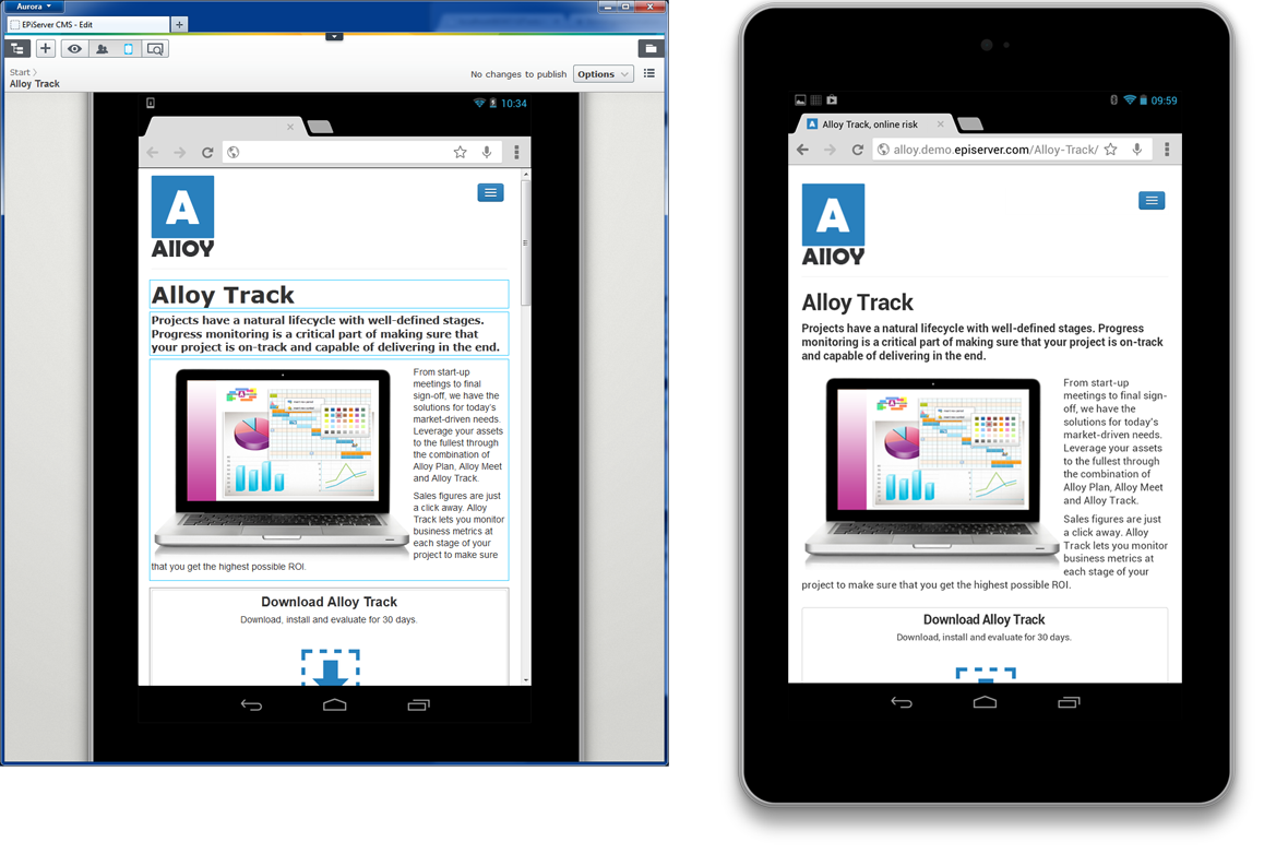
You should now be able to select Nexus 7 in the resolution drop down and get the preview as shown below, with the browser preview to the left and the actual rendering to the right for comparison.

While this approach of course does not give the exact same result as on the actual device, it can give the editor a fairly accurate idea of how a page will look on a different screen.
Last updated: Mar 31, 2014
