") Area:
Area:
Gadget styling
The CSS styles used on the dashboard resets many of the default styling of elements added by the browser and in some cases adds its own default style. However, this styling may not be enough so you can use the following additional classes.
- epi-contentArea and epi-formArea, set on any containing <div> elements.
Registering styles on the dashboard
To get your style sheets on the dashboard, define them for your gadgets with the [CssResource] attribute.
Example:
[Gadget]
[EPiServer.Shell.Web.CssResource("Content/QuickChat.css")]
public class QuickChatController : Controller
epi-contentArea
The following CSS class gives you a Dashboard default look on tables, lists, headings and link colors.
Example:
 <div>
    <h2>Two handy CSS classes</h2>
    <ul>
        <li>epi-contentArea</li>
        <li>epi-contentForm</li>
    </ul>
     <table>
        <caption>Table caption</caption>
        <thead>
            <tr>
            <th scope="col">Heading One</th>
            <th scope="col">Heading Two</th>
            <th scope="col">Heading Three</th>
            </tr>
        </thead>
        <tbody>
            <tr>
            <td>Data A</td>
            <td>Lorem ipsum</td>
            <td>Dolor sit amet</td>
            </tr>
            <tr>
            <td>Data B</td>
            <td>Lorem Ipsum</td>
            <td>Dolor sit amet</td>
            </tr>
        </tbody>
    </table>
</div>
The code appears as follows without the use of epi-contentArea class:
Result (no epi-contentArea):
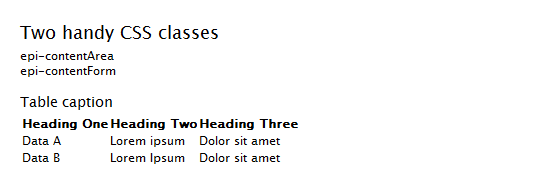
Adding the epi-contentArea class to the containing <div> changes the appearance.
Example:
<div class="epi-contentArea"> ...Result (with epi-contentArea):
If you want a table to look like the example without affecting any other child elements, use use epi-default or epi-simple (no borders or margins) classes directly in the <table> tag.
Example:
<table class="epi-default">epi-formArea
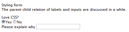
Form elements like fieldset, legend, input, textarea, and so on, have minimalistic styling by default.
<form action="#" onsubmit="return false;">
<fieldset>
<legend>Styling forms</legend>
<p>
The parent child relation
of labels and inputs
is discussed below.
</p>
<fieldset>
<legend>Love CSS?</legend>
<input id="radio1"
type="radio"
name="radio1" 
checked="checked"
value="1" />
<label for="radio1">Yes</label>
<input id="radio2"
type="radio"
name="radio2"
value="2" />
<label for="radio2">No</label>
</fieldset>
<div>
<label for="text1">Please explain why</label>
<input id="text2"
type="text" value="" />
</div>
</fieldset>
</form>Result (no epi-formArea):
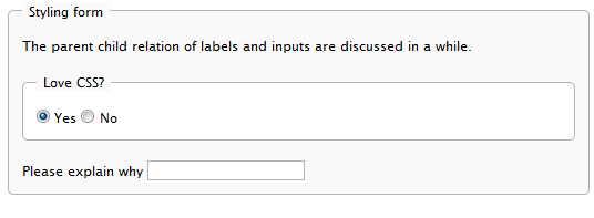
Setting the epi-formArea class on the <form> element gives it a more stylized look.
Example:
<form class="epi-formArea">Result (with epi-formArea):
There are also some sizing classes that could be used individually on inputs, selects, labels or containers for labels.
- epi-size3 (Not on labels or containers for labels)
- epi-size10
- epi-size15
- epi-size20
- epi-size25
- epi-size30 (Not on labels or containers for labels)
Note: This does not work on the <select> element in IE but still take the width of the content.
By setting an input element inside a label, the label automatically is associated with the input without having to set the id attribute on the input (and the for attribute on the label). This is perfectly valid HTML and you avoid having the same id twice in a page, which the use of two gadgets of the same kind in a page would result in.
The parent-child relation also results in alignment possibilities of labels and form fields:
<form action="#" onsubmit="return false;" class="epi-formArea">
    <fieldset>
        <legend>Styling form</legend>
        <div class="epi-size10">
            <label for="label1">Label one</label>
            <input id="label1"
            class="epi-size3" type="text" />
        </div>
        <div class="epi-size10">
            <label for="label2">Label
            two</label>
            <input id="label2"
            type="text" class="epi-size15" />
        </div>
        <div class="epi-size10">
            <label for="label3">A
            really long label which will break row</label>
            <select id="label3"
            class="epi-size15">
            <option>Option One</option>
            <option>Option Two</option>
            </select>
        </div>
        <div class="epi-size10">
            <label for="label4">Label
            four</label>
            <input id="label4"
            type="text" class="epi-size30" />
        </div>
    </fieldset>
</form>
Last updated: Nov 25, 2015